
Demystifying Board Games: Die Cutting
Ever ask yourself what needs to happen in order to get fabricate your favourite games? In this series, we’re going to pull back the curtain and demystify a bunch of manufacturing hoops our games go through to get to the table; starting with Die-Cutting!


The ‘Output Preview’ panel from Adobe Acrobat showing that the “DIE LINE” layer is created in a SPOT colour which allows it to be easily separated from the artwork beneath.
I thought it'd be interesting to take a look at some of the behind the scenes stuff that takes place during the development and production of our favourite board games. This post is intended to be the first in a series that demystifies what happens between handing off the game’s press files getting it the table for that first play.
As a graphic designer, one of the things I do on a regular basis is create 'die lines' for various elements of the games I work on. In the manufacturing process, die lines are essentially guides that the printer can use to ensure the correct layout and presentation of the final product. Die lines are usually placed on a separate layer and can be used as guides for cut lines, fold lines, embossing, and spot treatments like ultraviolet varnishes (UV). But what happens to this ‘digital’ line that I’ve created to turn it into something that can be used to cut out custom tokens and other components?
A Token History
Shaped cardboard tokens and components play a central role in the vast majority of tabletop games, but have you ever asked yourself how exactly do they make all those cuts on the boards we take so much pleasure in punching? You might think the easiest way to do it would be to laser cut the sheets of paper and cardboard, but in-fact, the process is much more analogue than that and has some pretty old roots.
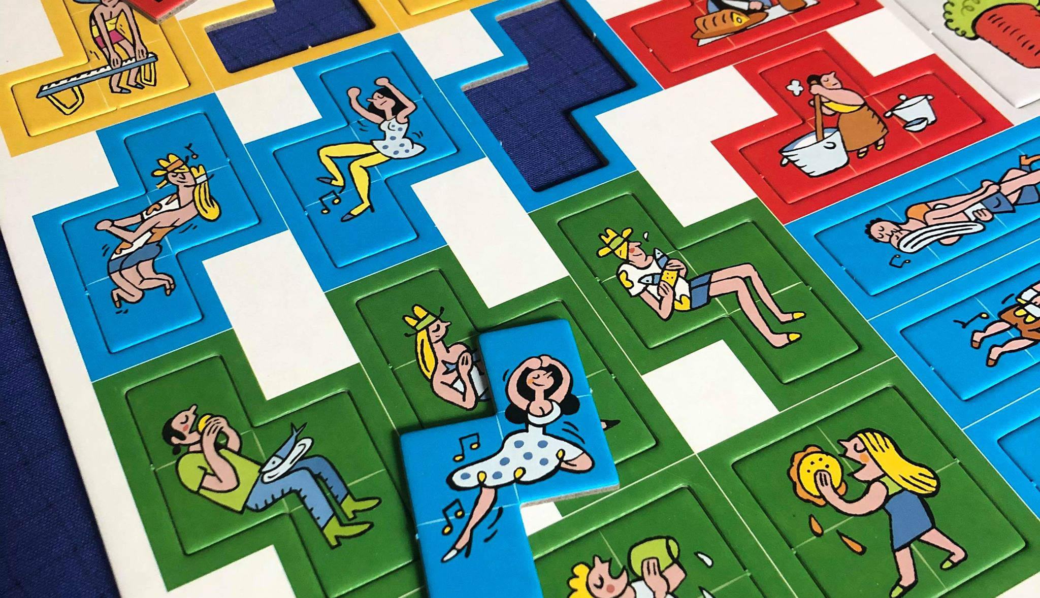
Arraial Punch Board (Pandasaurus Games)
Photo Credit: Danni Loe
Die-cutting started in the mid-19th century as a process used in shoe manufacturing for cutting leather. The die-cutting process can be done either on a flatbed or rotary press. The difference here is that while the rotary press method is quicker and more efficient, there’s a larger cost to it compared to flatbed die-cutting.
When it comes to printing, creating a cutting die was once a very manual process. It involved the use of jigsaws, pliers, tin snips and a lot of perspiration. The pressman would manually cut the shapes with a jigsaw and then painstakingly shape and cut the steel rule cutting blade with pliers to fit. The steel rules were then carefully hammered into place using a wooden mallet. This ‘die’ would then be pressed onto the printed sheet of paper or board to create the required cuts.
Stepping Into the Future
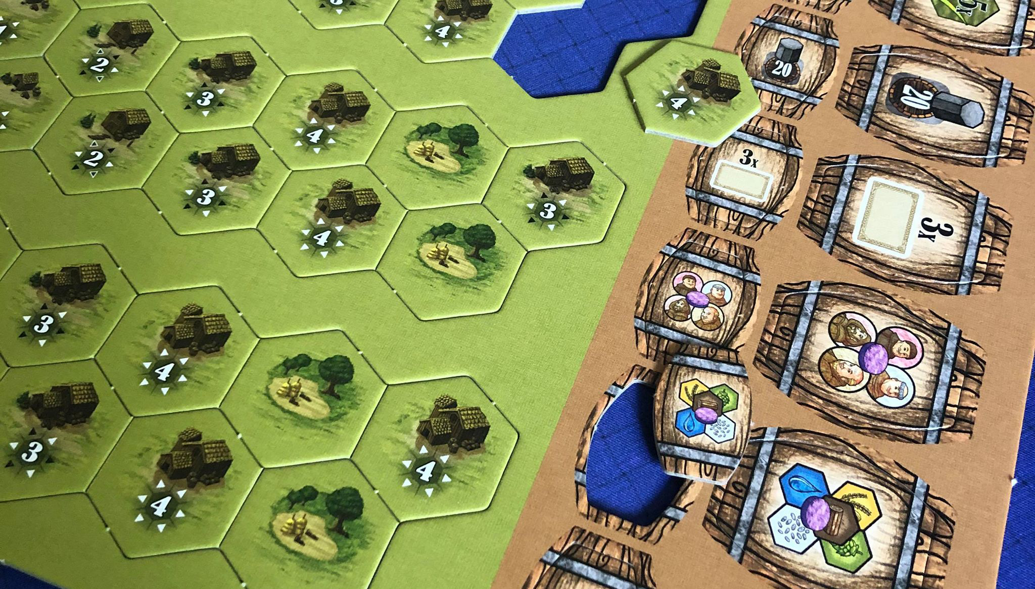
These days, the die-cutting process is largely an automated through CAD (Computer Aided Design). A laser cutter is used to create the channel in the wooden base for the die blade and the blade itself is shaped and cut using a specialized hydraulic machine press. From there, the pressman takes the shaped blades and seats them into their corresponding place on the board using a mallet.
From there, the finished dies are placed into the press where test runs are conducted to register the newly created die with the printed artwork. Once registration is complete, the press is all set to start die-cutting!

Hopefully this has (at least partially) demystified what goes on during the die cutting process. There is so much that goes into printing our favourite games that I felt I wanted to pull back the curtain a little, and shed some light on the different procedures and processes that give our games the table presence that knocks our socks off time and time again.
Up Next: Meeples!
Next time, we’ll peel back the layers of just exactly how wooden meeples are made. Until then, I hope you all stay happy and healthy! All the best,
Matt
PS Thanks to Danni Loe for the awesome punchboard pics. :D

Brand Consistency for game publishers
Live and die by the brand. Is your brand being represented in a consistent and professional manner across all channels? Here are a few thoughts that may help you ensure that what you put out there is speaking a unified visual message.
Nike. Apple. Coca-Cola. I don't know about you, but my mind's eye is assaulted with colours, logos, and a multitude of other images at the very mention of these well-known brands. Sure, they're all very successful companies that each have a litany of products that bare Nike's 'swoosh', Apple's autological piece of fruit, or Coke's signature lettering, but one thing all of these uber-well-known brands have in common is that their brand is represented consistently in all things they do.
To some, it may not be a big deal to see the Coca Cola logo in a shade of red that's slightly darker than the norm, or the Nike Swoosh is horizontally compressed so that it fits some ad space. Quite honestly, they probably wouldn't even notice, but the reality is, every time the brand's visual identity marks are incorrectly used, the brand suffers. Consistent representation of a brand across all media gives the consumer a touchstone or base of what to expect to see from that brand.
In terms of brand consistency, as a graphic designer, I tend to frame things based on how the brand's visual marks and styles are being represented, but really there are so many more aspects to it that contribute to how people picture a brand in their mind's eye. Things like tone of voice, choice of supporting photography, and even third- party organizations who the company chooses to align with can drastically change the way people see the brand.
OK, with that mentioned, let's get back to the visuals. How does a company ensure that their brand and vision is represented in a consistent manner? For mom & pop shops or even small companies, there is often a single individual responsible for creating and maintaining the company's visual identity. They're the only one creating ads or packaging or graphics for the web, so they control the reins and are able to adhere to the style that they've setup without having to refer to documentation. When you get into larger organizations where its harder to manage who's creating what, they rely on a simple tool with easy to follow examples and instructions, detailing how to and how not to use the company logo and other identity marks. This document is often referred to as a Style Guide or Brand Guidelines.
The anatomy of a Brand Guide
LOGO TREATMENT
The logo is your brand's 'workhorse'. Sometimes, this is the only element of your brand that you're able to communicate with. Wouldn't it be reassuring if you knew that it was always used the way you intended it to?
This part of the brand guide deals specifically with the logo and how it's used on media and in concert with other elements. Things like placement on printed media & online, minimum 'gutter' (distance between it and other objects) and it's proper physical representations. For instance, ensuring that the logo isn't stretched or compressed, the fonts or colours aren't changed, or that it is used in it's entirety and not edited.
In terms of game design, consistency in how the logo is treated can take many forms, a couple of examples are logo placement on the game box or it's size and placement in the rulebook. Establishing guidelines for items like this will help you maintain a consistent look and feel across all of your games.
Consider this excerpt from the City of New York's brand guide outlining proper (and improper) uses of their iconic logo.
City of New York's take on how to and not to use their brand mark.
TYPOGRAPHY
If you know me, or have read any of my other posts, you'll know that I'm a bit of a freak when it comes to type. Some people feel that the fonts you use can speak as loudly for your brand as your logo does. When done right, the fonts you've chosen to represent your organization can elevate your overall brand. Like any good design, they should be 99% invisible. That is to say, they should seem so well with the other elements of your brand that they themselves aren't noticed, but they contribute to your unique look and visual experience.
In the brand guide, this section is your opportunity to specify what your official fonts are and how they should be used. You can detail things like for marketing ad titles, use Shackleton Condensed (a beautiful font by Mattox Shuler of Fort Foundry, btw) or that all paragraph text must have a leading (spacing between lines) of at least 150%, etc. While you may use thematic fonts when it comes to selecting in-game fonts, there is certainly opportunity to standardize the fonts you use in content that appears across all your games like the legal text on the back of the box and in the rulebook as an example.
Alienware Brand Guidelines on use of their primary typeface; Avenir.
COLOUR PALETTE
Remember that 'not quite right' Coke red we talked about earlier? Well, nothing drives me up the wall more than when colours are off and it's blatantly obvious. You may be thinking that only the designer or someone else close to the brand will ever notice something like that, but if you've done your job right, and have imprinted your brand onto the minds of the public, then they too will sense that something's amiss. They may not be able to put their finger on it, but something will appear not quite right. Imagine an avid gamer with dozens of games in their collection. Now imagine that they have more than one of your games, and that they like to store a publisher's games together and for some reason each of the games are displaying your logo in all it's glory, but each one of them is a slightly different hue. Turns out, you just haven't gotten around to writing your brand guide, and as a result, there's no place that says that the red in your logo is Pantone 185C, or that your blue is 95C, 74M, 10Y, and 0K (Values for the CMYK colour space).
It's as simple as listing a chart in your brand guide with all of the different colour values for your chosen hues. When I'm creating one, I make sure I list values for Pantone (coated and uncoated), CMYK (for 4 colour print jobs), and finally RGB and Hex values for on-screen applications. Now, of course, you can take this as far as you want by specifying how and when to use certain colours depending on the application and setting. Ultimately, it's your call when it comes to creating these guides.
The Red Cross' Official Colours
PHOTOGRAPHY
They say that a picture is worth 1000 words, just imagine those words crossing the minds of your client base when they see one of your ads that uses supporting photography. Whether you commission a photo shoot or purchase a royalty-free stock image from your favourite collection, the tone and composition of the images should be singing the same tune as everything else in your brand arsenal.
When creating the photography guides for the brand book, ask yourself what feelings you want consumers to associate with your brand. From there, you can set the rules for using photography with the brand. These 'rules' can be as simple as adjectives that describe the overall feel of the photos, or you can drill down even further by addressing content, ethnic representation, product placement and many many other things. For instance, the Adidas brand guide lists "Warmth, Spirit of Sport, and Athlete-Centered" as visual characteristics of their brand, makes total sense right? Now take those characteristics and apply them to another brand, say NASA; doesn't quite fit, does it? This is why it's so important that all parts of your brand speak to the same goal, the old adage rings true here. The whole is greater than the sum of it's parts.
When it comes to game publishers, the photos you use can tell a story as to what types of games you make, what age they're targeted to, and if they're a fun, party-style game, or a game for the more serious strategist. Choose wisely.

Adidas' Brand Guidelines for Photography
Spread the word.
Make it accessible.
The more people I work with in the industry, the more I'm realizing that it is a very decentralized work environment. Teammates may reside in the same city, but they may just as easily be separated by a few states or provinces, or even continents! For this very reason, it's uber important to make sure everyone on the team is up to date on the brand. For consistent brand execution across all channels to be successful, it needs to be easily accessible and simple to implement.
Consider sharing a folder on your preferred cloud platform with all the necessary tools like the brand guidelines document, logos in all the approved formats, fonts, document templates...everything. Keep the conversation going by having regular info sessions, or roundtable discussions on how the brand was successfully (or unsuccessfully) implemented, this is a great way to share successes and learn from mistakes while keeping everyone current on the brand.
Templates are fantastic for consistency. By providing templates for documents, social posts and other communication media, you can help ensure that Sally's facebook post falls inline with Cody's the week after.
Depending on the size of your organization, you may (or may not) have somebody responsible for marketing or creative services. Often, these individuals are the among the most familiar with the brand. Consider the benefit of funnelling print jobs and other outward-facing items through them for at the very least, a review to ensure that the brand is being respected. They'll likely catch subtle errors like an improper font weight or slightly off hue in the logo which may be imperceptible to others.
Wrapping it up.
One thing I find about tabletop games is that the only real consistency is that they use different artists and graphic designers all the time. They mix and match the creative team to suit the thematic tone of the game, and this makes total sense. Unfortunately, one of the pitfalls of consistently working with different people is that reigning in brand consistency becomes more and more difficult. With an established, rock solid set of tools like a brand guidelines document, logos for all applications, fonts, and document templates, this difficult task becomes easier. Having a 'Brand Bible' to refer to will take the guesswork out of it and enable your entire team to express your brand in a professional, consistent manner across your products, ads, and all other channels. When that avid gamer gathers all of your games together on their shelf, you can be confident that your brand is being represented as you intended.
Looking for inspiration to create your own brand guide? Freelancer.com has put together a great list of 100 brand guides from some industry leaders. Take a look.

Typography & Tabletop Games
First in an ongoing series of posts about design in general and in the tabletop game industry.
Anyone who knows me would call me a type geek. Over the past decade, it has really become a passion of mine. Sometimes (actually, who am I kidding, MOST of the time) when playing a game, my fellow players will be waiting for me to take my turn, not because I’m a victim of analysis paralysis, but because I’m studying the cards in my hand, silently (or sometimes vocally) commenting on and correcting the typography no-nos of the game which we’re supposed to be playing. With an, “Oh, sorry…”, I take my turn and go back to my silent typographic review.
One of the most commonly overlooked things in Tabletop Game UX (User Experience) is how typography can really enhance (or diminish) game play. By and large, game cards and boards aren't simply a mishmash of unremarkable text (laid out in Comic Sans) and generic symbols. They are intentionally designed with beautifully thematic works of art, carefully curated typography and all the UX elements and content necessary for game play.
When it comes to looking at what ‘good typography’ means for games, there are a bunch of things to consider:
- Type Size & Spacing
- Type Colour & Contrast
- Font Selection
- Orientation, Placement & Justification
Type Size & Spacing
This year, I turned 45. I started to wear reading glasses just after I hit the big 4-0, so one of the things that aggravates me is unnecessarily small type. There’s no good reason to put 5pt type on anything that is not meant to be read with a magnifying glass. When you’re at the game table, or better yet, at a local pub’s game night where the lighting is far from bright, it’s incredibly frustrating trying to read minuscule text; you end up squinting, holding it up to a brighter light, or doing whatever else that helps, all of which causes delays and diminishes the game play experience.
While I don’t have a hard and fast rule about minimum type sizes, mainly because every font reads differently at different sizes, things like the size of the counters (spaces within the letterforms, like the ‘eye’ of a lower-case e) or x-height can make fonts easier to read at small sizes (more about that later in Font Selection). In general, 9 or 10pt body text is usually a nice, readable size, of course, this may vary depending on the font. If I must go lower for whatever reason, 8pt is usually as low as I’ll go.
When setting small type, it's also a good idea to loosen the tracking (space between letters) and leading (space between lines). Rather than force the player to read a dense, tightly packed block of mice type, this additional room between characters and above/below each line will increase the legibility of the text and reduce the amount of effort required to read it.
Generally, when reducing point size of type, you should also narrow its measure (line length). One or two lines can be ok to read at longer lengths, but anything more than that and you run the risk of losing track of the correct baseline and having to reread the passage.
When in doubt, PRINT IT OUT! Don’t trust the screen, it’s back-lit and has much higher contrast than a printed card or board would. The only way to get a true sense of what it’ll be like is to print it out, get it in front of you and judge for yourself.
Type Colour & background Contrast
You may have chosen the perfect font for legibility. It’s got great characteristics for reading at all sizes, it’s beautifully thematic and everything...but unless the contrast between the colour of the text and the background it lays upon is high enough to easily read the letterforms, you’re hooped.
This is something I see far too often when it comes to tabletop games. Great font choice, poor choice of colours. Sometimes the contrast is so low, it’s barely able to be made out, even in daylight. There are a few things we can do to help make our text as readable as possible. First, select a type colour that is of high-enough contrast from it’s background where it doesn’t impact readability. To help with this, I often consult an online colour contrast checker like webaim.org. This tool will check the contrast levels between your text and background and give it a pass or fail based on industry accessibility standards. While this tool is primarily meant for screen-based content, the principles translate over to print quite well.
Font Selecton
Up until now, we've talked about how you deal with type assuming you've already chosen that perfect font. I sometimes spend hours looking for just the right font for my project. One that speaks to the theme, but is also versatile and readable enough not to hinder game play.
Commercial vs. Free
Whenever possible, I use professionally designed commercial fonts when laying out a game. I've even gone personally out of pocket because it wasn't in the budget to purchase fonts for the game. The down side of it is professionally designed fonts aren't free. Sometimes they cost upwards of $100 just for one style or weight, but the good, IMHO far outweighs the bad. The money you spend on a font designed by a professional type designer buys you a font that:
- Has the 'right' anatomy. Type designers are educated in 'how' letterforms should look to stay with traditional norms and to increase it's readability. Improperly shaped letterforms may cause errors in the font and end up costing you thousands when the game is sent to print.
- Is well-kerned (the spacing between each of the letterforms is adjusted so they play well with other letters). Having a natural look and flow to a font is something that is unnoticeable when done well and sticks out like a sore thumb when its not.
- Has multiple styles and weights. Type designers will often create multiple weights (light, regular, bold, heavy, etc.) and styles (oblique, small caps, etc.) to create a 'family' for their font. This is especially beneficial when using the font for body text where you need to emphasize selections of the text and have it stand out for the reader.
- Will not be used by many (or any) other games in the market. So, you've found the perfect free font. It fits your theme, its actually well-constructed and it even has a few weights to it. Unfortunately, a dozen other designers also took a shine to it and used this free font for their medieval-themed game as well.
That's not to say that free fonts don't also have their place. They're easy to find, there are plenty to choose from and ... they're free! Unfortunately, these awesome no-cost fonts often only have a single weight, are only for non-commercial use, or don't have full character sets.
In the end, whether you use paid or free fonts, ensure that you get what you're looking for from your chosen typefaces. Think character set, weights, versatility and cost.
Theme
Theme is a very important component to font selection...it's where I start. Every. Single. Time. I find that using a font whose theme is a poor match to that of the game can sometimes affect game play in a negative way. Take the time to peruse your personal collection or an online (free or paid) font house for a typeface that plays well with the game theme. When choosing a themed font, be careful not to venture too far into the theme as to affect legibility. Your post-apocalyptic game might be amazing to play, but the destroyed font you chose for card title is SO eroded that it's nigh-illegible.
Weights & Styles
The ability to utilise different styles to add different forms of emphasis to your heading and body content can be very useful in increasing readability of your game components. Fonts score bonus points with me if they have multiple weights and styles. Bare minimum for me to consider them for paragraph content, they need to have regular and bold weights with their respective italics. Other weights like thin, light, heavy and black or styles like smallcaps, display, etc. can give the type some added versatility.
Font selection is much like picking the right outfit for an occasion. It should fit in in it's style and general aesthetic, but at the same time, have it's own distinct character and panache to add that certain 'je ne sais quoi' to your game.
Orientation, Placement & Justification
Text on game components can be vertical, horizontal, rotated 90 degrees, or even curved around an object. It can be tempting to use one or several of these tactics when laying out your text, but we also need to be careful that by employing these tactics, we don't sacrifice readability.
While it is often visually appealing to layout paragraph text on cards and boards with centre justification, in a practical sense, left justified text is generally read more easily.
Best policy, in my experience is to play with it and shop it around to others whose opinion you trust to find your final presentation.
Conclusion
With thousands upon thousands of free and paid fonts out there to choose from, font selection and implementation is something that will give your game (if done well) an upper hand on others. Be specific, logical, and intentional with your game typography so that you craft as immersive a theme as you can for your game while maintaining it's gameplay and production quality. Trust me, you won't regret it.