

Demystifying Board Games: Die Cutting
Ever ask yourself what needs to happen in order to get fabricate your favourite games? In this series, we’re going to pull back the curtain and demystify a bunch of manufacturing hoops our games go through to get to the table; starting with Die-Cutting!


The ‘Output Preview’ panel from Adobe Acrobat showing that the “DIE LINE” layer is created in a SPOT colour which allows it to be easily separated from the artwork beneath.
I thought it'd be interesting to take a look at some of the behind the scenes stuff that takes place during the development and production of our favourite board games. This post is intended to be the first in a series that demystifies what happens between handing off the game’s press files getting it the table for that first play.
As a graphic designer, one of the things I do on a regular basis is create 'die lines' for various elements of the games I work on. In the manufacturing process, die lines are essentially guides that the printer can use to ensure the correct layout and presentation of the final product. Die lines are usually placed on a separate layer and can be used as guides for cut lines, fold lines, embossing, and spot treatments like ultraviolet varnishes (UV). But what happens to this ‘digital’ line that I’ve created to turn it into something that can be used to cut out custom tokens and other components?
A Token History
Shaped cardboard tokens and components play a central role in the vast majority of tabletop games, but have you ever asked yourself how exactly do they make all those cuts on the boards we take so much pleasure in punching? You might think the easiest way to do it would be to laser cut the sheets of paper and cardboard, but in-fact, the process is much more analogue than that and has some pretty old roots.
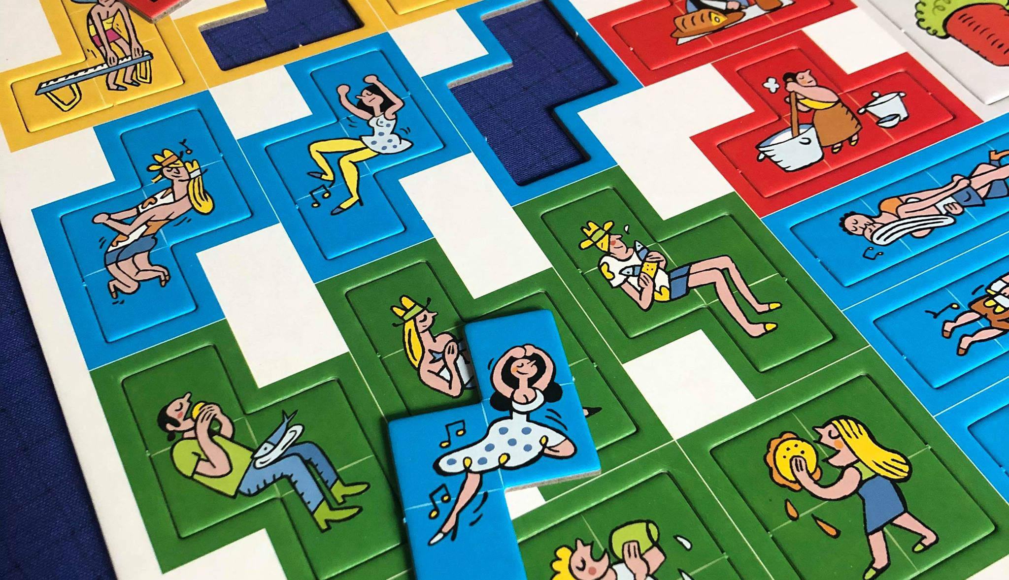
Arraial Punch Board (Pandasaurus Games)
Photo Credit: Danni Loe
Die-cutting started in the mid-19th century as a process used in shoe manufacturing for cutting leather. The die-cutting process can be done either on a flatbed or rotary press. The difference here is that while the rotary press method is quicker and more efficient, there’s a larger cost to it compared to flatbed die-cutting.
When it comes to printing, creating a cutting die was once a very manual process. It involved the use of jigsaws, pliers, tin snips and a lot of perspiration. The pressman would manually cut the shapes with a jigsaw and then painstakingly shape and cut the steel rule cutting blade with pliers to fit. The steel rules were then carefully hammered into place using a wooden mallet. This ‘die’ would then be pressed onto the printed sheet of paper or board to create the required cuts.
Stepping Into the Future
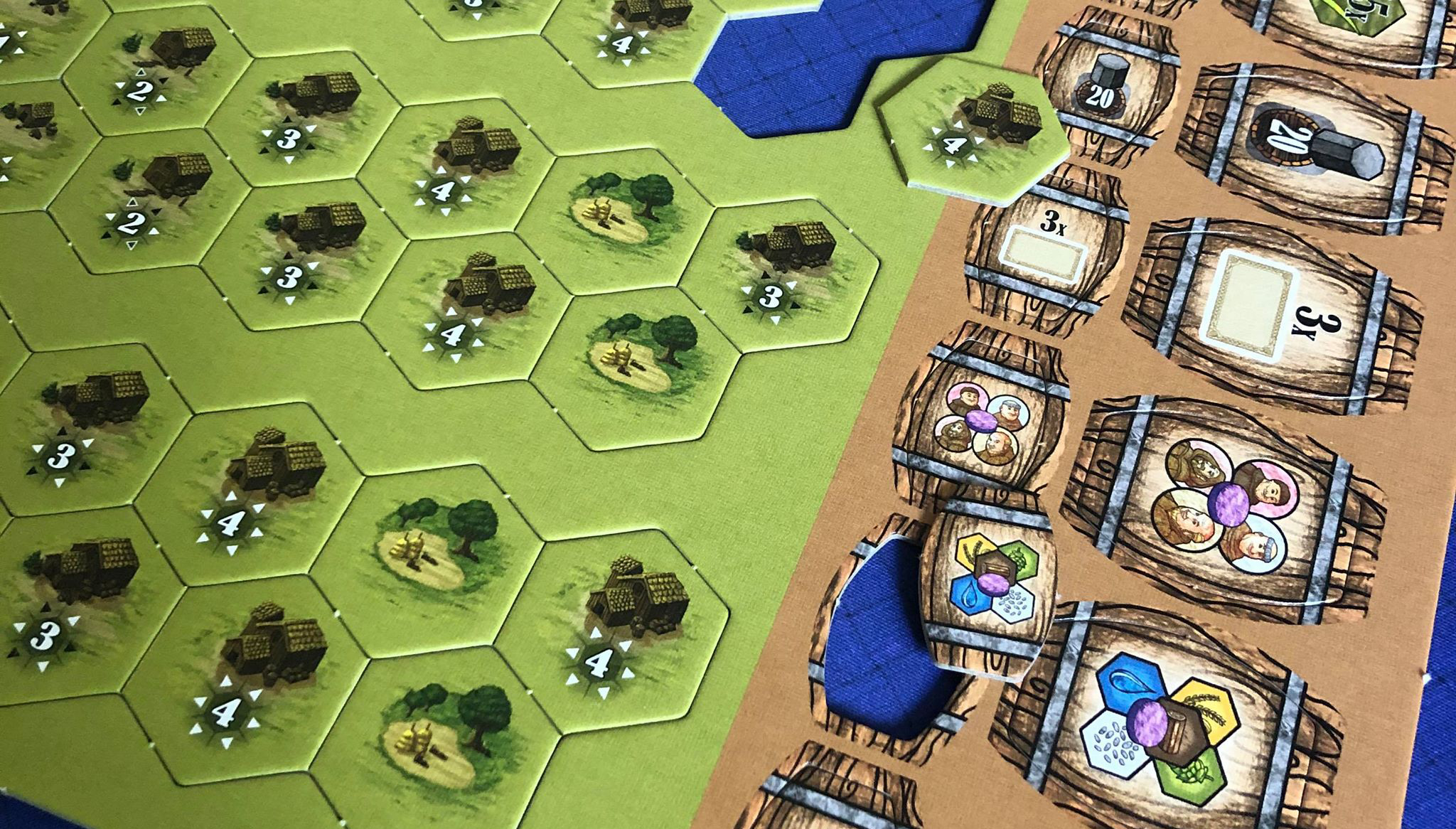
These days, the die-cutting process is largely an automated through CAD (Computer Aided Design). A laser cutter is used to create the channel in the wooden base for the die blade and the blade itself is shaped and cut using a specialized hydraulic machine press. From there, the pressman takes the shaped blades and seats them into their corresponding place on the board using a mallet.
From there, the finished dies are placed into the press where test runs are conducted to register the newly created die with the printed artwork. Once registration is complete, the press is all set to start die-cutting!

Hopefully this has (at least partially) demystified what goes on during the die cutting process. There is so much that goes into printing our favourite games that I felt I wanted to pull back the curtain a little, and shed some light on the different procedures and processes that give our games the table presence that knocks our socks off time and time again.
Up Next: Meeples!
Next time, we’ll peel back the layers of just exactly how wooden meeples are made. Until then, I hope you all stay happy and healthy! All the best,
Matt
PS Thanks to Danni Loe for the awesome punchboard pics. :D

All in the family: Applying a common style to your game's components

Families, like tabletop games, come in all shapes and sizes. The larger they get, the more diverse their members tend to be, yet despite this diversity, each one of them bears traits that tie them together like green eyes or blonde hair which make them recognizable as kin. Rather than let nature and DNA take its course, when designing for board games, we must rely on our creative ability to manufacture these ‘family traits’ so that when everything is laid out on the table, there is no denying that all of the components belong to the same game.
These days, it’s all too easy to keep your designs strictly digital. The benefits of printing out your design iterations can’t really be oversold, we’re making a printed product after all! Periodically producing hard copies of your components and laying them out on a table as they’d be in a game will give you a better sense of size, orientation, colour, how well the components play together and how well they carry the overall style and theme of the game.
Depending on their function in the game, components may (by design) have a distinctly different visual appearance than other components. In cases like these, it’s even more vital that we sew the seeds of kinship into them. One thing I do when starting on a new game, is create a sort of mini style guide for how I’m going to handle visuals throughout the game. In this style guide, I define things like typographic style, iconography, visual tone, and a colour palette. Once I’ve got these nailed down, I can easily apply these styles to each of the components as I design them. Furthermore it gives me a clearly defined structure upon which to construct the components.

There’s an obvious benefit to creating a style guide for your game: all your components will play nicely together, aesthetically speaking that is. But are there some less-obvious benefits to doing so as well? You bet there are. Even though we may not be consciously aware of it, our eyes pick up on little things that, if done poorly, can interfere with comprehension or usability…or in my case just really irk me. We’ve talked about how creating a typographic style can help unify the look of your components, well, we can enhance that sense of cohesiveness by establishing set type sizes for different uses throughout your game. For example, you’ve got 4 different types of cards, each of which have a different purpose, but all have similar text elements like title, ability, and numerical stat values. Unless it’s physically impossible, I try to standardize these common elements. In terms of designing our 4 card types, let’s say we make the titles 16-point Shackleton Condensed, the abilities 10-point Termina Regular, and the stat values 14-point Termina Heavy. Barring any outside interference, we can be fairly certain that the legibility across all card types is now pretty consistent. (All of these typefaces, btw, can be found at Fort Foundry, by Mattox Shuler. Do yourself a favour and check ‘em out!)
One shining example of a successful game-wide style application (or in this case across two games) is Brass published by Roxley Games. Roxley flawlessly creates a style that firmly embeds you in the industrial revolution of the 19th century. A clearly visible style can be observed throughout each of the two games; Brass: Lancashire and Brass: Birmingham. Beyond that, even the campaign page of the Kickstarter offering is beautifully crafted to immerse you in the theme.

In this excerpt from the Brass Kickstarter campaign page, Roxley does a wonderful job of applying the visual style of the game to the Kickstarter page, reinforcing the immersion and thematic impact of the game.
Another ‘not-so-obvious’ plus to establishing a style guide for your game is incorporating or adhering to a corporate/brand. One publisher that immediately jumps to mind is Red Raven Games. We all know a Red Raven game when we see it. Part of this has to do with the fact that most (if not all) of the games are done by one illustrator; Ryan Laukat. More than that, there’s a distinct common style to several other elements that Ryan employs on Red Raven games. This does a great job of unifying the brand offering and from a design perspective, there’s a lot less guess work that needs to be put into creating the style for that particular title. That is not to say that there aren’t also benefits to straying from the corporate brand, but this needs to be done with forethought and intent in order for it to still look professional.

Near and Far, Islebound, and Above and Below all have a similar visual style that does a great job reinforcing the Red Raven Games brand.
All of this to say, whether it’s blatantly obvious or a little on the subtle side, applying a game-wide visual style to your game will not only give it more table-appeal, but will likely also enhance playability. Continuing to refine your process and defining what ‘style guide’ means to you will help you put forth a more visually consistent, well-designed product and probably increase your productivity too!
Brass: Lancashire and Brass: Birmingham are ™and © Roxley Games.
Near and Far, Islebound, and Above and Below are all ™ and © Red Raven Games.
Shackleton and Termina fonts are ™ and © Fort Foundry.

Tabletop Graphic Design: Rulebooks 101
There are some very useful techniques that can really help us attain these goals. Here are a few things that I do when creating an accessible rulebook that flows well.
Like many core game components, if a rulebook is done well, it can elevate the play experience, and if done poorly, it can grind the game to a screeching halt. Good rulebooks can resemble works of art that have just the right combination of text, images and diagrams which make it easy for you to quickly locate the information you need and not get bogged down in that which you don’t. Bad rulebooks often look like dense seas of text with little to no design hierarchy or diagrams making it necessary for you to read more than necessary to find the information you’re looking for.
Broad Strokes
My general layout M.O. (modus operandi) is keep it simple, keep it legible, and don’t make me read more than I have to. There are some very useful techniques that can really help us attain these goals. Here are a few things that I do when creating an accessible rulebook that flows well.
Judge a Book by its Cover
While some designers like to jump right into the rules by jamming the cover page with introductory text and instructions, I much prefer to treat the experience like any ‘book’ experience which means a nice thematic cover that leads the gamer down the garden path into our game’s world. Of course, there are always exceptions to this, for instance if adding the cover page would bring the book from 8 pages to 12 (since a booklet’s number of pages are multiples of 4) and we’d be stuck looking for content to fill the extra pages.
To the Margins and Back
When text is laid out in short columns, it’s easier to read. We’ve all been there, you’re trying to juggle setting up a game or navigating your way through a complex scenario, and you keep losing your place while struggling to read a 10” long line in a sea of text. By laying your text out in multiple, narrower columns, you make it easier to read overall. Additionally, by laying out your text in columns, you are able to utilize the available real estate more efficiently which reduces whitespace and also adds flexibility for flowing around objects.
Air it Out
“Whitespace” is not a four letter word (10, actually), but seriously, adding the right amount of whitespace can increase the legibility by spreading things out a bit and making the document less dense. The trick is to know when to say ‘when’. Adding too much can unnecessarily bump up our page count or make it difficult to follow, too little and we run the risk of making it impossible for the reader to easily navigate through the dense document.
A Picture (or table, or list, or diagram) is worth 1000 words
If I can say something in a table, list, or diagram, I generally choose to do just that. The majority of the reader’s interactions with the rulebook will be quick fact checking or rule confirmations while in the heat of play, and not cover to cover reads with a nice glass of brandy while sitting by the fire. Because of this, we need to make it as easy as possible for them to find what they’re looking for, and fast! When reading rules, our eyes gravitate to lists, diagrams and tables, they give us lots of information in a bite-sized, easy to navigate format, so whenever I get the chance, this is my preferred method.
Have a Plan
Jumping in to the design of a rulebook with both feet can get you into a little bit of hot water. You end up having to make sweeping changes to make up for poor planning. Do yourself the favour of taking the time to define things like column layout, character and paragraph styles (and their hierarchy), image, figure and table treatments and page numbering. These elements form the backbone of your document and should you need to modify any (or all) of them, the integrity of your document will remain intact.
In the end, your common sense will win out. When in doubt, take a step back and try to view it through the eyes of the end user. The goal is to make an easy to read, easy to follow document that facilitates you having a great game!

Art Direction for Tabletop Games: Maximizing Artists' Output
Art direction advice for non-creatives…
When it comes to tabletop games, good art direction can elevate the title to great things, and conversely poor art direction may, in fact, be a prominent nail in it's coffin. The role of creative or art director on a project often falls on the shoulders of a classically trained artist with 20 years of experience, but just as often, it's a hat worn by the project manager or some other team member who may not have that artistic background and experience. I find the latter describes how many smaller publishers operate; several people wearing several hats.
As a graphic designer who has worked on a dozen games, literally hundreds of art assets created a multitude of artists, the end product supplied by these artists can unfortunately vary a great deal. This variance can end up causing delays and costing you money from having to deal with inefficient or improperly setup files. Here are five points that will hopefully help you standardize the quality of product you get from your artists and in turn make a better game.
1. Go Big or Go Home
There's nothing better than playing a game that has gorgeous card and board art. It enhances the immersive experience and increases the overall level of enjoyment. So, that's great...you've got this awesome game with killer art and amazing graphic design. The time has come to promote it at the next big con. Your graphic designer sends you a proof of the booth wall panel, featuring some character art from your game, but for some reason, its so blurry that you feel like you're suffering the effects from a half-dozen cocktails when looking at it. Really it's a resolution problem. The 300dpi artwork is stunning at 100mm, but as soon as you blow it up to anything larger, it looks horrible.
As a graphic designer for tabletop games, if I want to make the marketing and packaging assets look incredible, I turn to the card art. That's often where the big wow factor is. Repurposing card art for large format graphics can be a bit tricky, however. If the resolution just isn't high enought, you can do things like run it through an upsizing filter like On1's Perfect Resize, or Alien Skin's Blow Up, but in the end, the results can be spotty and there's really no substitute for having high resolution art to begin with.
Obviously we can't demand that artists create their pieces at mural-sized dimensions, but if we pick something in the middle, we can usually satisfy most (if not all) of our needs. Card art that is 3000 pixels wide will serve us well. At card size, the resolution will be in the neighbourhood of 1200dpi (for a 63x88mm card), no issues there. Next, we have the box. If it's say, a 300mm box and the character is the main art, again, we're solid at 250-300dpi. Fast forward to creating those booth wall panels. The good thing is at that size, viewing distance will not be at arms length which means the resolution doesn't need to be that high. 75dpi is usually just about right for these types of applications. If your art falls below the minimum resolution for these large-format pieces, don't give up hope. Upping the resolution in these instances is a lot more forgiving than it would be for something handheld.
2. The whole is greater than the sum of its parts
Like I said, card art is your go to for impact. One of my greatest pet-peeves is finding that perfect piece of art for the rulebook or box, etc. only to discover that the left arm is missing because it appeared behind something on the card. These assets will be your greatest ally in creating all of your promotional material. If you're legs are cut off at the knee (literally) you either have to choose another piece, or do some fancy maneuvers to hide the fact that the art is not whole.
Ask the artists whenever possible to create the art so that the characters or main actors on the stage (could be equipment, etc.) are as whole as possible. You'll be thankful you did in the long run.
3. Layered...you know, like an onion!
Again, this point all comes back to versatility. As a graphic designer, working with layered art where the lighting effects, character and other objects are on separate layers than the background, makes my job SO much easier. Having to cut out the character from flat artwork not only is frustrating and time consuming, but it costs you, the publisher, moolah.
Asking your artists to supply layered files is a no-brainer. Not only can you easily use each of the elements on their own, but you also have the convenience of being able to tweak size and positioning to suit your needs. For example, if your particular card framework is slightly overlapping a key part of the character, you can just shift the character to one way or another to fix it. Easy peasy.
4. RGB vs. CMYK
When it comes to creating artwork digitally, you have a few options for what 'colour space' you create your masterpiece in. Mainly there are two or three colour spaces that most artists and designers work in; RGB, CMYK, and Greyscale.
The RGB (Red, Green, and Blue) colour space is what screen graphics are created in as it represents the colour components of light for that particular hue. The CMYK (Cyan, Magenta, Yellow, Black) colourspace represents the components that make up a pigment (or printed) hue rather than a light hue. Your home or office colour printers work on this CMYK model with distinct inks for each of the colour components layered on top of each other to produce the resultant hue.
When you send your game files to the printer for mass production, they're going to insist that all art be CYMK. OK, great, so that means you should ask your artists to supply CMYK art, right? Not necessarily. One big advantage of the RGB colour space is that it is much larger than that of CMYK. This means that you'll have a little more flexibility for expression in RGB. Some people choose to create all art in RGB and then convert to CMYK just before sending to print so that they can retain as much expression of colour as possible. This comes down to a personal preference between flexibility and work needed.
5. Who's the creative one here, anyway?!
This one is hard for a lot of people. Releasing creative control into the hands of the artist can leave you with a feeling of vulnerability. It is important to know what you want. More importantly, it's good to know how to express it in a way that gets your point across, but frees the artist up to knock your socks of by taking it in an awesome direction that you may not have thought of yourself.
If you have certain details that absolutely, MUST be present in the art, then by all means impart those kernals to the artist. The tricky part comes in expressing style and direction without giving specific examples which, in the end may look like more of a knockoff rather than an homage. For instance if you wanted a Game of Thrones-esque throne to appear on a card, you could easily just say exactly that, but chances are you'll get something that people will point out, possibly with derision. Instead, if you describe the throne as "a grandiose, medieval throne made up of other objects", you may get something a little more original and less of a knockoff.
Ultimately, this is your game, your vision, your dream. Bear that in mind when providing direction to the artist, but don't be afraid to give them creative freedom when possible; I guarantee you'll be pleasantly surprised more often than not!