

The Publisher/Graphic Designer Relationship (Part V)
Passion is what keeps us going at 3 AM on a project that is ‘done’, just not ‘finished’. It's what drives us to spend 3 hours creating the perfect Instagram post from our trip to grocery store instead of working on the paying gig that’s due tomorrow. Sometimes it's our BFF, other times? Less so. The pertinent question here is how are your designers putting their passion to work for them?

The Passionate One
Well the good news is, as designers, we’re a pretty passionate bunch. Passion is what keeps us going at 3 AM on a project that is ‘done’, just not ‘finished’. It's what drives us to spend 3 hours creating the perfect Instagram post from our trip to grocery store instead of working on the paying gig that’s due tomorrow. Sometimes it's our BFF, other times? Less so.
The pertinent question here is how are your designers putting their passion to work for them? First off, do they give a shit? No, really. Are they bringing their ‘A-Game’ or are they simply ‘phoning it in’? One of the things that I try to do for every project is to establish a level of ownership. By doing this, I find that I push myself harder, I take more pride in what I’m doing, and defend it with conviction. I really feel that It makes for a better product.
When your designer takes a sense of ownership for your product, they’ve now got skin in the game. When they take pride in the work they’ve done, they’ll be more likely to be an ambassador for your brand and projects. If I see one of my clients’ brands being mistreated on implemented in a bad way, I pick up the phone or reach out to them to see if they were aware of it and ask if I can help so it doesn’t happen again.

In the end, suppliers who truly care about you and your brand will result in producing superior products that you can be proud of and stand behind.
Next Up…
In the 6th part of this series, we’ll explore the ‘x-factor’ part of the relationship. What little (or not so little) things does your designer do to set them apart from the rest?

The Publisher/Graphic Designer Relationship (Part IV)
In Part IV of this series, we take a look at “The Evil Genius” persona of graphic designers. Possessing the knowledge is only half the battle…the other half is how they put that knowledge to work!

The Evil Genius
Measuring knowledge when it comes to graphic designers is kind of a double-sided coin. On one hand, there’s the innate and learned knowledge centered around design, fabrication, and user-experience. On the other hand, there’s the ability to use the tools of the industry, like Adobe Creative Suite. This is another area where graphic designers and artists differ. It’s imperative that the graphic designer has enough knowledge to design the files, assemble them into components and supply press-ready art to the printer whereas artists have more flexibility to create their art in whichever medium they feel comfortable in, whether it’s digital art or oils on canvas.

One of the great things about a knowledgeable graphic designer is that they can meaningfully contribute to virtually every stage of the game design process.
The Prototype Phase
Designers can assist in initial prototype layout and iteration. By bringing a designer in at this stage, they are able to apply some rudimentary UX principles which can go a long way to making the game that much usable a lot earlier.
Having a designer on board at this early in the process, the layout choices that are made can enhance user experience and facilitate gameplay.
Production Phase:
Lean on your designer to assist in writing the artists’ brief to define requirements like size, format, and composition in order to best work with the components.
Make informed choices on component materials by relying on your designer’s experience and expertise in print media.
Designers can consult on colour and type choices that maximize legibility for colorblind and other visually impaired players.
Any good designer will craft well structured and annotated source files that can be easily edited.
Press Phase
Designers can assist in preparing error-free press files, especially for those tricky processes like punch boards, spot UV, and other press treatments that require special attention.
Navigate the tricky world of print by bringing your designer in to liaise with the printer to iron out any press issues (because there are always a few!)
All of this to say that I’m a big proponent of ‘all hands in’ from the get-go. Bringing key people, like graphic designers, on at the beginning of the project can (and likely will) improve the end product.
Mmm Curves
I’ve had the pleasure of working as a designer in several industries; each one of them had a learning curve of their own to contend with. At the museum, it was discovering how to design things that were large and would stand up to being used by thousands of people each month. The tabletop industry is no different. Finding a designer with specific tabletop experience is a definite asset. If you can’t find a designer with previous tabletop experience, I’d recommend that they at least have a fair number of print jobs under their belt. When I say print, I’m talking about offset jobs done on a press, not small run jobs done at your local Kinko’s. Another benefit of hiring a designer with print experience is that there’s a good chance they’ve already made some rookie mistakes and learned from them. I speak from personal experience, they can be costly!
Wrapping up, I’d say that in your search for your design unicorn, make a point to chat with the candidates and get a feel of where their experience lies, how varied it is, and how deep those pools of knowledge are. Once you’ve had a chance to do this, hopefully, you’ve found someone who checks all the right ‘design-smarts’ boxes.
Next Up…
In the 5th part of this series, we’ll get to the heart of the matter. Literally. We’ll explore the driving forces that help us dream up these wonderful creations. In a word? Passion.

The Publisher/Graphic Designer Relationship (Part III)
In Part III of this series, we take a look at “The Action Hero” persona of graphic designers. How your designers act and comport themselves says a lot about them and the services they offer.

The Action Hero
If we take a sample of 100 people working in this industry, I wouldn’t be surprised if only about half of them make games as their main gig while the rest have day jobs and choose to make games in their off-time. Some people might call this professional vs. amateur, and they may have a point, however for our purposes here, let’s shift it a little towards speaking about the way in which we conduct ourselves.
When I’m wearing my business hat, I try to conduct myself in a way that facilitates trust. I want my clients to feel that I’ve got their back and that when I’m off working on my own, and that I’m doing so in a way that would reflect well on them.
One thing that breeds trust with clients is transparency. When your designer is a straight shooter and openly shares information like why they make the decisions they make or how they think things are proceeding, it fosters a feeling that you’re on the same team, working towards the same goal. Transparency can be turned inward as well. As a creative professional, I sometimes find myself in a situation where the chosen solution resides outside of my wheelhouse. When this happens, I have to ask myself if this is something that I’m willing to learn or is it just too far outside my comfort zone? Whatever the case may be, I feel that it is important to be transparent about this with my client rather than to venture down the garden path hoping that my attempts will be successful.
Another facet of being professional is taking care in the way in which you speak to clients. When speaking to your designer, do they often use design jargon which can sometimes be confusing to non-designers, or do they get their point across clearly and concisely in plain language? If they’re taking the time to explain things in terms that you both understand, I feel that it speaks to their professionalism way more than if they chose to use technobabble that you may or may not understand.
As I mentioned last time, clients and designers may not necessarily be in the same city, country, or even continent, so meeting at the local coffee shop for a tete a tete just isn’t feasible. I feel that it is important to get as much facetime as I can with my clients, whether it’s in person, should we live nearby one another, at a convention, or even over a video chat. Email and text messaging are fine, but it’s important to keep that personal connection alive.
How are their organizational skills? Do they have a method to their madness? Dealing with a designer who has well-established processes in place can make all the difference in the world. Without some process and organization, error-creep can start to become an issue. Older versions of files may be sent to the printer or making the latest round of changes to an older file.

“The only difference between a mob and a trained army is organization.”
The creative process is iterative by nature. Feedback and revisions are a vital ingredient in making our games the best they can be. While it may happen from time to time, nailing a design on the first pass is a rare thing, as it should be. Part of this whole ‘professional’ attitude is how we as designers handle criticism and feedback. When we pour our heart and soul into things, like board games, for instance, it can be easy to take constructive criticism personally. I’d be lying if I said it still doesn’t happen to me, but I’d like to think that I’ve become better at responding to it than when I was a fledgling web designer who flew off the handle at the first critical word. I’m not saying that you should always be in agreement with your designer. On the contrary, designers are passionate people and the difference lies in how they express that passion when dealing with negative client feedback. A designer who can articulate the reasons why they used a certain approach and why it objectively works for the product is very different than a designer who takes the comments personally and bites back in retaliation. Simply put do they handle any criticism, good or bad, with grace?
Finding that mild-mannered designer who can strap on the spandex and mask to fight the powers of bad design can be a difficult task, but a noble one to be sure. There’s a certain solace to be found in working with someone whom you have complete trust in; and by extension, a goodwill ambassador for you and your project.
Next Up …
They say that knowledge is power. Well, in this case their knowledge is your power! The more that your graphic designer knows and how well they can apply that knowledge can go a long way in determining how fluidly your project flows. The “Evil Genius” is next up in our look at many facets of the graphic designer persona. Thanks so much for sticking with us, and we look forward to catching up with you in Part IV of the Publisher/Designer Relationship series.

The Publisher/Graphic Designer Relationship (Part II)
The key to every successful client relationship that I’ve had has been communication. When there is a continuous 2-way flow of communication between client and designer, there are no big surprises, deadlines aren’t a problem, and things just seem to go more smoothly.

The Communicator
The key to every successful client relationship that I’ve had has been communication. When there is a continuous 2-way flow of communication between client and designer, there are no big surprises, deadlines aren’t a problem, and things just seem to go more smoothly.
What does good communication look like?
Take a minute and think about the last time you worked with a graphic designer.
Were they attentive and engaged in what you were saying?
Did they ask questions?
When you reach out, were they quick to respond?
In general, do they keep in touch on a regular basis?
If you checked most or all of these boxes, it sounds like you’ve got a pretty solid relationship. On the other hand, if you answered no to at least 1 or 2 of these, then you might have felt a little frustration from time to time due to poor communication. There’s nothing more aggravating than receiving design proofs that clearly don’t reflect your direction, or flirting with blowing a deadline because you haven’t heard from your designer in weeks and are unable to reach them.

Just as important as the frequency of communication is also the depth; do you find that you and your designer have to go over the same concept multiple times or on multiple occasions? If there is such an obstacle in communication, you might try setting aside some time to figuring out what this difficulty is. The sooner these misinterpretations can be dissolved the better, and not casting blame but instead making a conscious effort for collaboration will keep tempers from flaring.
Many of these issues are eliminated when you’ve got a great flow of communication with your designers. And furthermore, now that we live in a world where you can collaborate remotely with colleagues all over the globe, staying in regular, positive communication is that much more vital, especially when you can’t just hop in your car and meet at the local coffee shop to hash things out.
Recognizing if there’s the potential to build a solid base of communication with your designer will pay off ten-fold. Once you’re both on the same frequency, things will do more smoothly and all the stakeholders rest assured that the focus is on creating the best product without having to deal with poor or intermittent lines of communication.
Next Up …
Now that we have an idea of what a good commuincator looks (and acts) like, we’ve got a solid base for builiding a great relationship with the graphic designers we work with. In the next installment of The Publisher/Graphic Designer Relationship, we will be introduced to “The Action Hero”, who puts their money where their mouth is. Until then, citizens!

The Publisher-Graphic Designer Relationship (Part I)
The relationship between a game publisher and graphic designer is a very intimate one. Often, graphic designers are involved in the project longer than most anyone else, as they can provide meaningful contributions throughout the entire game development process. As a publisher, you may not know what exactly to look for in your graphic designers. This series is meant to help familiarize you with the qualities you should look for and expect to find any graphic desingers whom you choose to work with.

Part I: Introduction
Like any working relationship, the one between a board game publisher and their graphic designer(s) can dramatically improve the quality of a project/product. In this series of blog posts, I’ll be touching on how to set expectations that will mutually benefit everyone, as well as exploring the different facets of what makes a designer someone you should work with.
I’ve worked in a bunch of different sectors as a graphic designer. In the 90s, I started off at the Federal Government where I quickly learned what I didn’t want to do, then moved to a large telecom company in Silicon Valley (North) and then most recently working at a museum as a graphic and exhibition designer. Each one of these jobs taught me some great things, some of which I still rely on.
What Exactly is a Graphic Designer?
Before we get into what we should be expecting from our designers, I thought I’d take a minute to go over what graphic designers are and what they aren’t.
When it comes to describing what we do, we often refer to labels to quickly get the point across like “I’m a mechanic”, or “I’m a high school teacher”. In the tabletop games industry, however, It’s kind of funny. This is the first industry that I’ve worked in where the term “designer” isn’t referring to me, but rather to the game designer, the person(s) responsible for creating the game. We also use these labels when we credit the team members who helped make the game, often found on that back page of the rules. Terms like developer, editor, illustrator, game designer, and of course graphic designer.
Let's talk about two of those roles for a second; illustrator (or artist) and graphic designer. These terms are sometimes used interchangeably, and while they may share some of the same tools, they are two very different jobs.
Artists and illustrators are tasked with bringing the game designer and developer’s thematic dreams to life through art showcased on the game box and the components within. They help form the bonds between the player and the thematic setting of the game, which when done well, thoroughly immerses the player in the game. Their creative brief will likely speak to theme, style, composition, and aspect ratios, but in the end, they’ll be creating something that should stand out and catch the player’s eye.
On the flip side of the coin, if a graphic designer does their job well, most of what they do is invisible and works to bring the art and game play mechanics to the forefront. Some great examples of this is information design so that the most important things are read first, type selection so that the reader isn’t straining to read text, and user experience design which deals with laying the information and other elements out in a way that maximizes the ‘experience’ that the person has playing the game.
Here’s a look at how graphic designers and artists work on tabletop game projects:
Approach — As a graphic designer, when I approach a game, I try to be as objective as possible leaving all cards on the table so that in the end, what we come up with will appeal to and be usable by as wide an audience as possible. Artists on the other hand are often sought out specifically based on their subjective styles that the publisher or developer thinks would be a good fit to their game.
Modus Operandi — I look at every component as a problem I need to solve. I analyse things like information hierarchy and functional placement of the info so that game play isn’t inhibited. Artists rely on expressionism to drive home the feeling of the theme and setting the scene.
Trigger Effect — When working on a game as a graphic desinger, my ultimate goal is to make it easy for the players to understand the information I’m trying to impart so that they can play the game without getting caught up in clumsy user experience design. In contrast, From an artist’s point of view, one of the most important goals for their outputs is to provide an incredibly immersive experience. Make the player feel like they’re in an Ancient Roman coliseum, or feel like they’re competing in a baking competition.
Drive — There’s a big difference between playing a game with incredible gameplay, but sub-par graphics vs. the other way around. While they go hand-in-hand, I’d argue that I’d much rather play a game that’s really fun, but looks just ‘ok’. That being said, gameplay is the driving force behind most of what I do as a graphic designer, when it comes to working on games. Flip the coins for a sec and think about that artist. Creating art and illustrations is a very visceral thing. A lot of feeling is left on the canvas (digital or otherwise) which would go to reason that emotional response would be their driving force.
A Chorus of Voices
When I think about the quintessential designer that I’d like to work with, I find myself breaking them down into five distinct personas each representing personality and professional traits that I, myself, strive to embody with every client;

The Communicator
How well do they communicate with you? Are there long periods of radio silence, do issues arise due to poor communication?

The Action Hero
How do they comport themselves around you/ How about when they’re not around you? Do you feel like they’ve got your back?

The Evil Genius
How great is their ‘design kung-fu’? How well can they take that knowledge and apply it to their work and relationships?

The Passionate One
Creative types are passionate, that’s pretty much a given. Question is, how do they put their passion to work for them?

The Wunderkind
Do they go above and beyond? What’s that ‘x-factor’ they bring to the table, and how do they use it to benefit the relationship?
next up…
OK! Now that we’ve got a rough profile for our superstar designer, we’re all set to meet “The Commuincator". Part II of ‘The Publisher/Graphic Designer Relationship’ will take a look at how communication is key. Until then, citizen!

Demystifying Board Games: Die Cutting
Ever ask yourself what needs to happen in order to get fabricate your favourite games? In this series, we’re going to pull back the curtain and demystify a bunch of manufacturing hoops our games go through to get to the table; starting with Die-Cutting!


The ‘Output Preview’ panel from Adobe Acrobat showing that the “DIE LINE” layer is created in a SPOT colour which allows it to be easily separated from the artwork beneath.
I thought it'd be interesting to take a look at some of the behind the scenes stuff that takes place during the development and production of our favourite board games. This post is intended to be the first in a series that demystifies what happens between handing off the game’s press files getting it the table for that first play.
As a graphic designer, one of the things I do on a regular basis is create 'die lines' for various elements of the games I work on. In the manufacturing process, die lines are essentially guides that the printer can use to ensure the correct layout and presentation of the final product. Die lines are usually placed on a separate layer and can be used as guides for cut lines, fold lines, embossing, and spot treatments like ultraviolet varnishes (UV). But what happens to this ‘digital’ line that I’ve created to turn it into something that can be used to cut out custom tokens and other components?
A Token History
Shaped cardboard tokens and components play a central role in the vast majority of tabletop games, but have you ever asked yourself how exactly do they make all those cuts on the boards we take so much pleasure in punching? You might think the easiest way to do it would be to laser cut the sheets of paper and cardboard, but in-fact, the process is much more analogue than that and has some pretty old roots.
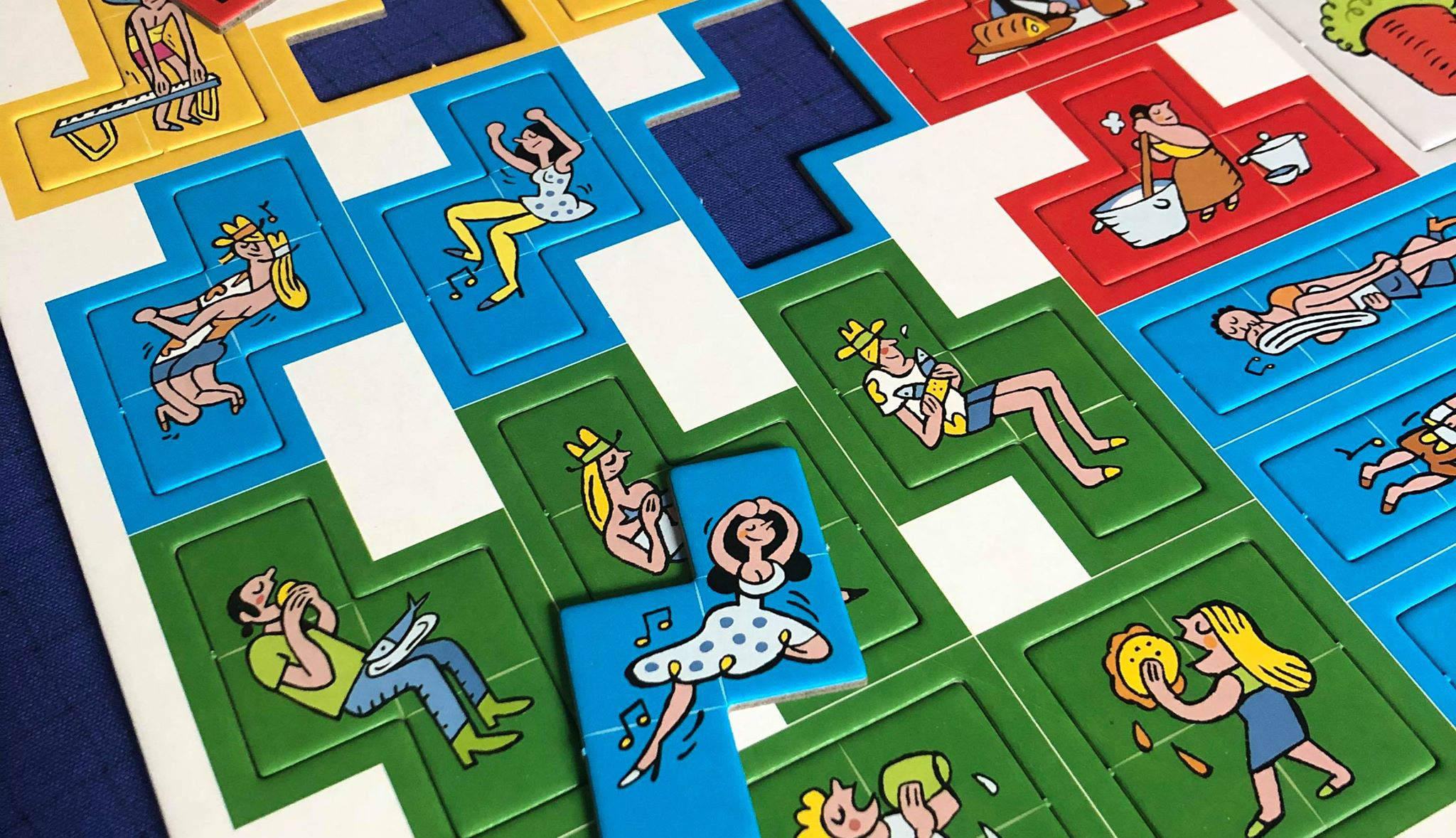
Arraial Punch Board (Pandasaurus Games)
Photo Credit: Danni Loe
Die-cutting started in the mid-19th century as a process used in shoe manufacturing for cutting leather. The die-cutting process can be done either on a flatbed or rotary press. The difference here is that while the rotary press method is quicker and more efficient, there’s a larger cost to it compared to flatbed die-cutting.
When it comes to printing, creating a cutting die was once a very manual process. It involved the use of jigsaws, pliers, tin snips and a lot of perspiration. The pressman would manually cut the shapes with a jigsaw and then painstakingly shape and cut the steel rule cutting blade with pliers to fit. The steel rules were then carefully hammered into place using a wooden mallet. This ‘die’ would then be pressed onto the printed sheet of paper or board to create the required cuts.
Stepping Into the Future
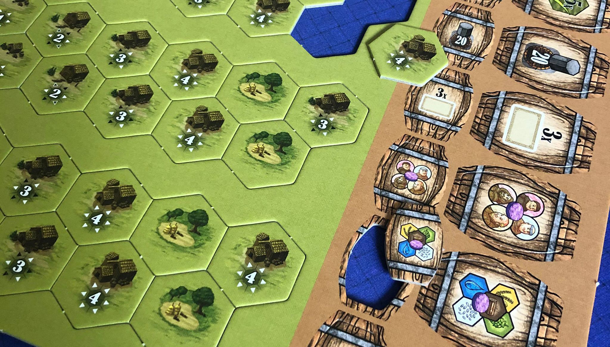
These days, the die-cutting process is largely an automated through CAD (Computer Aided Design). A laser cutter is used to create the channel in the wooden base for the die blade and the blade itself is shaped and cut using a specialized hydraulic machine press. From there, the pressman takes the shaped blades and seats them into their corresponding place on the board using a mallet.
From there, the finished dies are placed into the press where test runs are conducted to register the newly created die with the printed artwork. Once registration is complete, the press is all set to start die-cutting!

Hopefully this has (at least partially) demystified what goes on during the die cutting process. There is so much that goes into printing our favourite games that I felt I wanted to pull back the curtain a little, and shed some light on the different procedures and processes that give our games the table presence that knocks our socks off time and time again.
Up Next: Meeples!
Next time, we’ll peel back the layers of just exactly how wooden meeples are made. Until then, I hope you all stay happy and healthy! All the best,
Matt
PS Thanks to Danni Loe for the awesome punchboard pics. :D

The birth of Matt Paquette Co. — A look back at 2019
A look back at 2019—our successes, lessons we’ve learned and where we find ourselves now as well as a look into what’s coming for 2020.

Well, 2019 was a remarkable year for us. We are incredibly thankful to have been involved over 60 different projects, attended 3 conventions, and ended the year by officially changing our name to Matt Paquette co. (formerly 2421442 Ontario Inc.).
Among our 60+ projects in 2019, we had the pleasure of participating in the development of 21 Tabletop Games, refreshed 3 Brands with new Visual Identities, designed 425 linear feet of trade show display, and got to dream up a logo for a new Canadian tabletop games publisher.
We look back on our accomplishments over the last 12 months with beaming pride and our thoughts turn gratefully to those who have walked our path with us and have been instrumental in making our success possible. Thank you!
Here’s a look back at some of our projects over the last year:


the eternal student
All in all, 2019 proved to be more fun and rewarding than I ever could have imagined. As the company continues to evolve, I am constantly looking to develop new skills and hone some old ones, create new partnerships, strengthen current friendships, and pursue new and undiscovered avenues. Learning is just as much fun and rewarding as the work—they really go hand in hand.
Here’s a couple of things I’ve learned over the last 12 months that really stand out:
Don’t bite off more than you can chew — learn your limitations and how to successfully challenge them.
For entrepreneurs who provide a service, it’s often hard to say “no”—especially when you’re trying to grow your business. My philosophy when it comes to taking on new work has always been to only say “no” if we really can’t swing it. And even then, I try to never turn a client away without a recommendation to someone else who can help.
I’m a graphic designer who games AND works in the tabletop games industry, so saying “no” can sometimes be really difficult. There’s a bunch of intangibles that can factor into the decision like the opportunity to work with some of your favourite publishers (or game designers or artists, or writers, etc.), or working on a game that is being themed with one of your favourite IPs. Add these tidbits into the mix and suddenly it’s no longer cut and dry.
As Matt Paquette co. continues to evolve, I see my brush dipping more and more into the creative direction inkwell. In practical terms, this means I’ll get to work with some truly amazing graphic designers and artists on a more consistent basis. I started to dabble with this earlier this year, and since I was already looking to develop my management kung fu, it seemed logical to keep it going.
I quickly learned the value of time management and what my limitations were, not only in how many concurrent projects we could successfully work on, but how many people I could personally manage as well. In the end, I determined that the key (for me) was to find one or two incredibly talented designers and develop a strong working relationship with them. In a small amount of time, we developed a shorthand that was the linchpin to producing fiercely creative work.
Embrace your weaknesses
Let’s face it, right now Matt Paquette co. is an army of one (with some reserve members). I’m the CEO, the Executive, the Middle Manager and the Peon. From time to time I’m faced with the dilemma of tackling a task that I have no experience with. Do I learn the required skills and do it myself, Or do I put my faith in someone else to do it? After a few unfortunate experiences toiling away for hours on tasks that appeared to be pretty simple (but were deceptively difficult—to me anyway), I came to the realization that I needed a game plan when it came to ‘learning new stuff’.
Every time I encounter something that my fellow RPG geeks would classify as an ‘untrained skill’ I take a minute to determine if this skill is something that I will employ on (at least) a semi-regular basis going forward. If so, the next question I ask myself is ‘can a professional do it at less of a cost than the time it takes me? (Even when I have learned how to perform the task)’. It usually makes the decision pretty simple.
I suddenly find myself in a new situation, armed with uncertainty and optimism. I start this new path now not as a lone freelancer, but as an entrepreneur looking to build something larger than just me, which is changing and evolving on daily basis. I eagerly await what 2020 will bring for Matt Paquette co. I can’t wait to make new friends, meet some new colleagues, establish new partnerships, and transform the creative visions we see in our mind’s eyes into amazing new games, signage, web sites, and so many other fabulous things.
Onward and forward
As we sail in to 2020, we find ourselves working on some fantastic projects and can’t hardly wait to share them with you just as soon as we can! We’re working with some fantastic publishers on some truly amazing games. Keep your eyes open for:
Mariposas, Elizabeth Hargrave’s butterfly themed follow up to the Spiel des Jahres winner, Wingspan (AEG).
Cubitos, a fun & quirky little cubic-themed race game by John D. Clair (AEG).
The Paradox Initiative, the reimagining of Brian Suhre’s cataclysmic cosmic adventure featuring the art of 15 of today’s top tabletop game artists (Elf Creek Games)
Jurassic Parts, take on the role of a bullwhip-wielding paleontologist in this game by designer Kevin Lanzing. Race to claim your dig area and piece together the bones of enormous dinosaurs that roamed the earth so many years ago (25th Century Games)
Merchants of the Dark Road, Brian Suhre’s medieval themed game that thrusts you into the role of merchants vying to buy, sell, and trade goods from town to town in a desolate snow covered northern land (Elf Creek Games).
Danger Park, the game fashioned after the ill-fated “Action Park” in NJ. You’ll never forget your death-defying ride on the “Termite-Infested Roller Coaster”! (Story Machine Games)
The Lost Worlds of Josh Kirby. Journey through space as you settle and conquer worlds dreamt up by the uber-creative mind of legendary sci-fi illustrator, Josh Kirby (Bard Games)
Wonderland’s War brings you toe to toe with the characters of Alice in Wonderland, but in a way you never dreamed of. Fight to hold your own against foes like the Red Queen, The Mad Hatter, and the Jabberwocky! (Druid City Games / Skybound Games)
Castle Panic (2nd Edition) is the much anticipated refresh of the award-winning game from Fireside Games. The new look and added gameplay will be sure to entertain you! (Fireside Games)
Tutankhamun. A new take on Reiner Knizia’s Spiel des Jahres winning game. It’s Egyptastic! (25th Century Games)
Sagrada: The Great Facades — Life Expansion is the second of three expansions for Daryl Andrews and Adrian Adamescu’s beautiful stained glass window making game, Sagrada. (Floodgate Games)
These are just some of our current projects. Throughout 2020, we will be sure to have more news about other new and amazing projects that we’ll be sharing as they happen!
We are very excited about what 2020 has in store for us and look forward to taking those steps forward with our clients, partners, friends and colleagues. Cheers.
Matt

The Pros and Cons of Cons
Are you a budding professional in the industry? Are you wondering if the effort and costs of attending these events are worth it? In this blog I share my thoughts on it and offer some pros and cons you may want to consider before attending your next con.
Conventions. Millions of attendees flock to gaming and geek culture cons each and every year. The typical con attendee will meet up with friends, play games, and of course acquire mass quantities of the latest products and swag. While by nature, I would include myself (albeit to a lesser extent) in this group, I also belong to another demographic of attendees: those who are there for business.
It’s a common feeling among industry folk, that if you want to succeed, you need to attend the cons. While I agree with that statement, I have kind of a love/hate relationship with conventions. Many people would call me an extrovert, but when I’m surrounded by thousands of people for an extended period of time, it’s not long before I go looking for solitude.
I attended my first gaming convention just two years ago in 2017, when I was still only moonlighting in the industry. The convention I chose was Gen Con, the largest tabletop show in North America. Leading up to the con, I could hardly contain my excitement. I scoured the event database to fill my days with seminars, talks and workshops.
Finally, the day came, and I set foot in the Indianapolis Convention Centre. I had registered for the trade day workshops which took place the day before the con opened up to the public. This was mostly for educators with a wide variety of seminars on how to do things like integrate gamification into the classroom, etc. At the end of day 1 (technically day 0), I was feeling pretty great. It was an awesome day, filled with interesting sessions. If the rest of the con shaped up like this, it’d be great.

Friday Morning. Day 1 (for the public) of Gen Con. I was lucky enough to land a room in one of the hotels adjacent to the Convention Centre, so I walk across the skybridge into the convention hall. Immediately my pulse rises several beats. It’s pretty much wall-to-wall people. Right away, I liken it to attending concerts in the 80s back when they had general admission. Luckily my adrenaline is pumping pretty well at this point and it sees me through any trepidation I have. Onward and forward. I’ll spare you the play-by-play of the whole experience over the 4 days, suffice it to say, as time went on, I got used to the crowds and was able to escape away for some alone time when I felt the need.
After the initial shock of day 1 wore off a bit, I was able to get my bearings and make my way from event to event without much issue. There were still seas of people to wade through, but nothing unexpected. A large part of these conventions is the dealer hall. The place where you go to see the latest and greatest offerings from publishers and other vendors, and hopefully there’s even a copy left for you! Not feeling incredibly social most of the time, I did a great deal of window shopping in the dealer hall. I don’t go to these events as a consumer. I did create a list, but this wasn’t a list of games I needed to add to my collection, my list was a carefully curated list of publishers whom I’d love to work with.
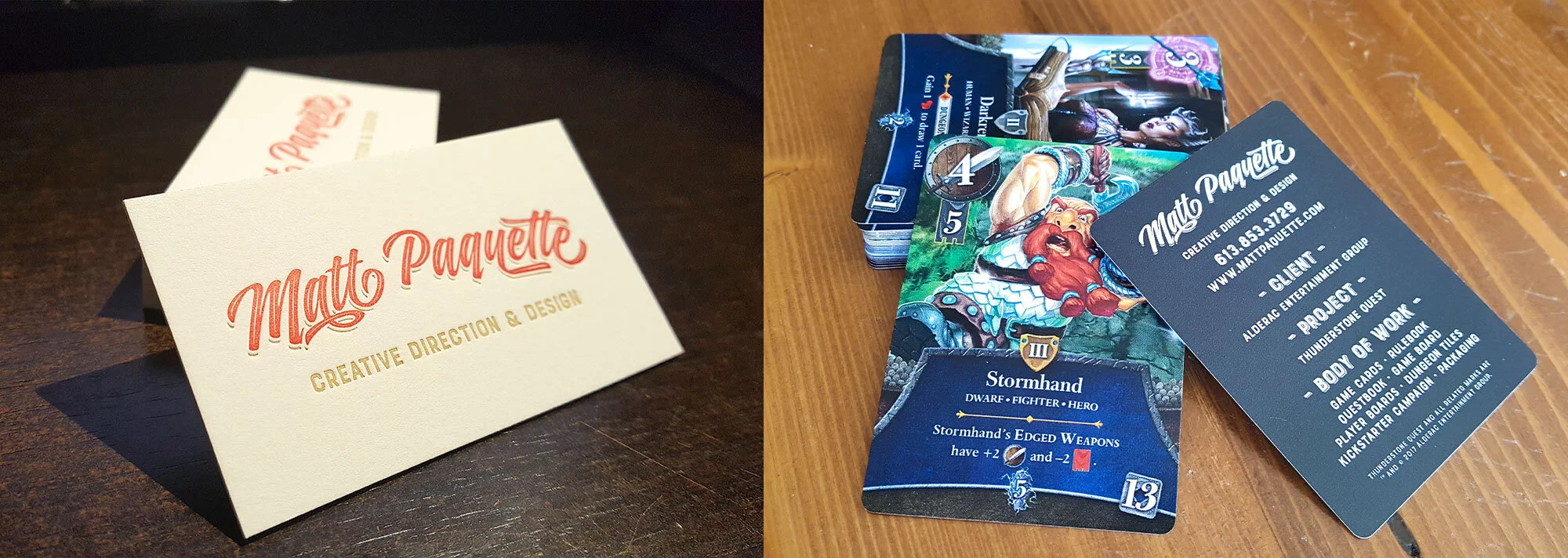
Armed with my hit list, new business cards, and some fancy self-promo swag, I made my way up and down the aisles, stopping in at the appropriate stalls. After the first or second booth, it became very clear to me that perhaps this wasn’t the best venue to make first contact. If you’ve never been to a large convention’s dealer hall, it’s pretty much non-stop all day long. These folks have very little time and what time they do have it’s usually spent selling their wares. That’s not to say that it stopped me. I did persevere! I did my rounds, some ended in successful introductions, some did not. Looking back, cold meetups at vendor booths wasn’t the greatest idea. If you contact the vendor ahead of time and ask what the best way to get face time with them is. Who knows, they may even suggest a meeting outside of the dealer hall hours! This past year at Gen Con, I reached out to many vendors who were more than happy to schedule me in. It’s amazing what a little planning can do!
I consider myself a ‘people person’. If you want to make it in this business, no matter if you’re a graphic designer like me, or an aspiring game designer, or a marketing professional, or anything else, the contacts you make in the dealer hall, at evening events, or even just gaming in the free play hall are invaluable. Even with video conferencing technology these days like Skype, there really is no substitute for the connections you make with someone in person.
The more events I attend, the more I become aware of other events out there. As a Canadian, making it to these conventions isn’t cheap. Most of the larger ones are in the United States. They often involve a long drive (or expensive flights), the costs of feeding, entertaining, and housing yourself, and let’s not forget the lost wages of taking the time off. Mind you, as you get to know people in the industry, you may be able to offset some of these costs by volunteering for the event, or working at a booth in the vendor hall. It’s becoming increasingly important to put some thought into picking and choosing the events I attend. It really just comes down to which event is the best fit for me at that time. Am I able to work a booth? Can I possibly car pool with friends who are also going? Will going to the event jeopardize any deadlines? I ask myself these questions and a bunch more when weighing the options.
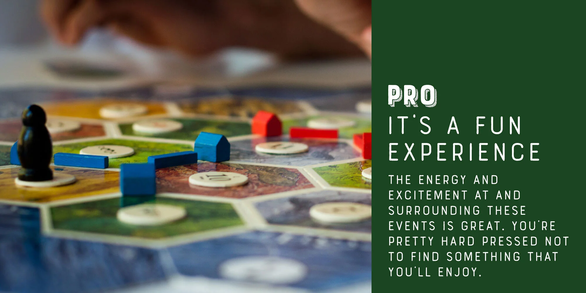


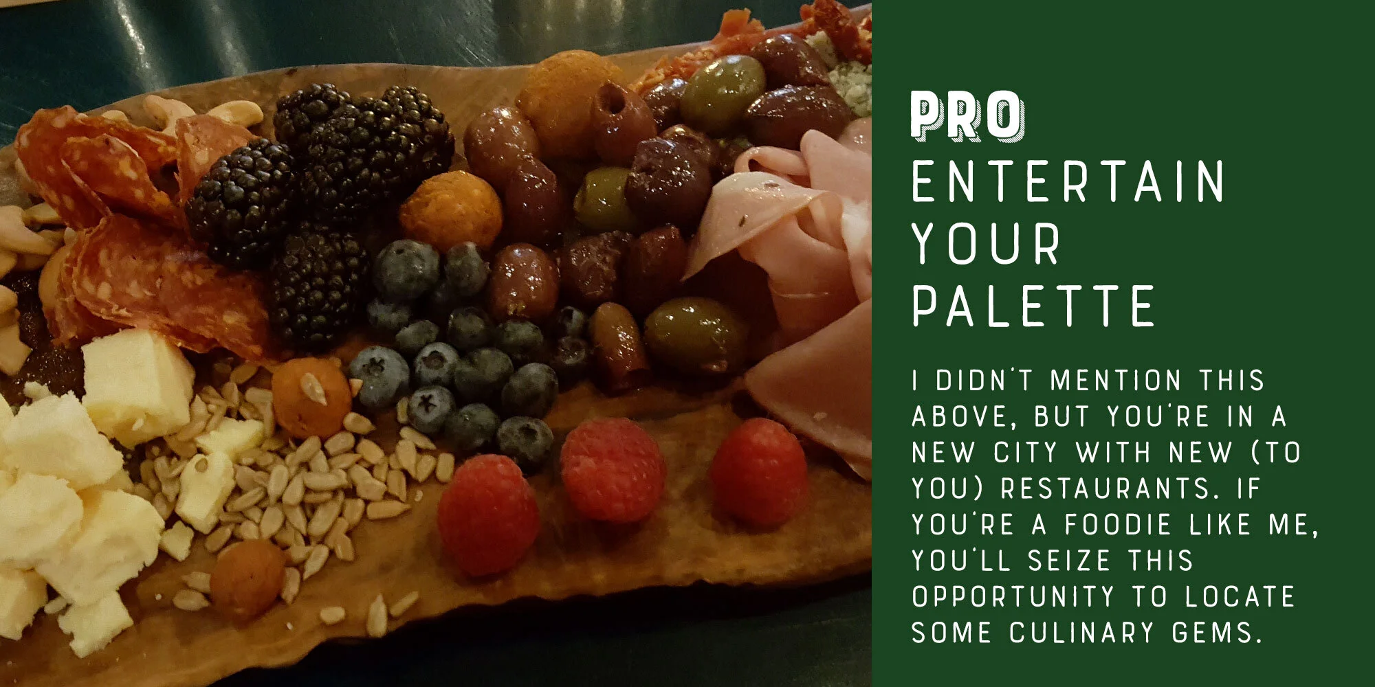

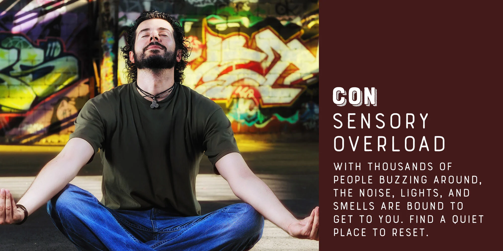

Pros
FUN EXPERIENCE: The energy and excitement at and surrounding these events is great. You’re pretty hard pressed not to find something that you’ll enjoy.
RECONNECT WITH FRIENDS AND COLLEAGUES: This is one of the main reasons I attend these events. The industry is filled with such kind-hearted and fun-loving people that I’ll take every chance I can get to see them.
EXPANDING YOUR NETWORK: Conventions are great for meeting new people. Who’s to say that these new connections need all be personal and not professional?! Keep a stack of business cards in your back pocket and explore. Take a chance, you won’t regret it. Fortune favours the bold!
FOOD: I didn’t mention this above, but you’re in a new city with new (to you) restaurants. If you’re a foodie like me, you’ll seize this opportunity to locate some culinary gems.
Cons
ALWAYS BEING ‘ON’ IS TAXING: If you’re there for business, you’re pretty much stuck in the “ON” position, meaning that you’ve got your business face on and with that comes an expected level of behaviour. Continuously operating like this is tiring, much more tiring than sitting around a game table with your best mates playing a game. You don’t have to worry about what you say or how you act (within reason of course), you can just be you. So when you get back to your hotel room, more often than not, your head hits the pillow pretty hard. Because of this, you need to seek out situations where you can recharge, whether it’s heading back to the room for some rack time, or just sitting by yourself for a few minutes. Whatever you need to do to recharge, do it often. This is a marathon, not a sprint :)
SENSORY OVERLOAD: Being surrounded by hordes of people and the constant din of the event is often too much and can really take it out of you. This is just another reason to dial in on those moments you can steal to recharge your batteries. Personally, I like to escape to a local restaurant and sit at the bar for a glass of red wine.
COST OF GOING: There’s a lot to consider when summing up the costs of going to an event like this. There’s the direct costs of travel (car or plane), food & entertainment, and, of course, the room. There’s also the indirect costs of the lost wages incurred from taking the time off. And lastly, we can’t forget those impulse buys in the dealer hall :)
Are you a budding professional in the industry? Are you wondering if the effort and costs of attending these events are worth it? Hard to say, I suppose that’s different for each person. In my case though, I feel that they are a good investment and worthwhile venture. The contacts I make are an integral part of how I operate and network. That said, while attending every con is impractical at best, I’ll do my best to pick and choose based on geography and timing.

All in the family: Applying a common style to your game's components

Families, like tabletop games, come in all shapes and sizes. The larger they get, the more diverse their members tend to be, yet despite this diversity, each one of them bears traits that tie them together like green eyes or blonde hair which make them recognizable as kin. Rather than let nature and DNA take its course, when designing for board games, we must rely on our creative ability to manufacture these ‘family traits’ so that when everything is laid out on the table, there is no denying that all of the components belong to the same game.
These days, it’s all too easy to keep your designs strictly digital. The benefits of printing out your design iterations can’t really be oversold, we’re making a printed product after all! Periodically producing hard copies of your components and laying them out on a table as they’d be in a game will give you a better sense of size, orientation, colour, how well the components play together and how well they carry the overall style and theme of the game.
Depending on their function in the game, components may (by design) have a distinctly different visual appearance than other components. In cases like these, it’s even more vital that we sew the seeds of kinship into them. One thing I do when starting on a new game, is create a sort of mini style guide for how I’m going to handle visuals throughout the game. In this style guide, I define things like typographic style, iconography, visual tone, and a colour palette. Once I’ve got these nailed down, I can easily apply these styles to each of the components as I design them. Furthermore it gives me a clearly defined structure upon which to construct the components.

There’s an obvious benefit to creating a style guide for your game: all your components will play nicely together, aesthetically speaking that is. But are there some less-obvious benefits to doing so as well? You bet there are. Even though we may not be consciously aware of it, our eyes pick up on little things that, if done poorly, can interfere with comprehension or usability…or in my case just really irk me. We’ve talked about how creating a typographic style can help unify the look of your components, well, we can enhance that sense of cohesiveness by establishing set type sizes for different uses throughout your game. For example, you’ve got 4 different types of cards, each of which have a different purpose, but all have similar text elements like title, ability, and numerical stat values. Unless it’s physically impossible, I try to standardize these common elements. In terms of designing our 4 card types, let’s say we make the titles 16-point Shackleton Condensed, the abilities 10-point Termina Regular, and the stat values 14-point Termina Heavy. Barring any outside interference, we can be fairly certain that the legibility across all card types is now pretty consistent. (All of these typefaces, btw, can be found at Fort Foundry, by Mattox Shuler. Do yourself a favour and check ‘em out!)
One shining example of a successful game-wide style application (or in this case across two games) is Brass published by Roxley Games. Roxley flawlessly creates a style that firmly embeds you in the industrial revolution of the 19th century. A clearly visible style can be observed throughout each of the two games; Brass: Lancashire and Brass: Birmingham. Beyond that, even the campaign page of the Kickstarter offering is beautifully crafted to immerse you in the theme.

In this excerpt from the Brass Kickstarter campaign page, Roxley does a wonderful job of applying the visual style of the game to the Kickstarter page, reinforcing the immersion and thematic impact of the game.
Another ‘not-so-obvious’ plus to establishing a style guide for your game is incorporating or adhering to a corporate/brand. One publisher that immediately jumps to mind is Red Raven Games. We all know a Red Raven game when we see it. Part of this has to do with the fact that most (if not all) of the games are done by one illustrator; Ryan Laukat. More than that, there’s a distinct common style to several other elements that Ryan employs on Red Raven games. This does a great job of unifying the brand offering and from a design perspective, there’s a lot less guess work that needs to be put into creating the style for that particular title. That is not to say that there aren’t also benefits to straying from the corporate brand, but this needs to be done with forethought and intent in order for it to still look professional.

Near and Far, Islebound, and Above and Below all have a similar visual style that does a great job reinforcing the Red Raven Games brand.
All of this to say, whether it’s blatantly obvious or a little on the subtle side, applying a game-wide visual style to your game will not only give it more table-appeal, but will likely also enhance playability. Continuing to refine your process and defining what ‘style guide’ means to you will help you put forth a more visually consistent, well-designed product and probably increase your productivity too!
Brass: Lancashire and Brass: Birmingham are ™and © Roxley Games.
Near and Far, Islebound, and Above and Below are all ™ and © Red Raven Games.
Shackleton and Termina fonts are ™ and © Fort Foundry.

2018: The Year I Invested in Cardboard
As I write this post, the clocks are rolling over to the New Year and I find myself, as many do, looking back on the past 12 months. 2018 represented a ton of new things for me, I was entering the new year as a full-time entrepreneur as I have done on occasion before, but this time was different. Instead of taking any (and all) work from a variety of industries that came my way, I would focus on one industry in particular. An industry that I have become quite enamoured with on both a personal and professional level over the last 5 years: Tabletop Games.
It all started with a colleague of mine. He was into ‘board games’ and asked if I would like to come to his place one weekend for a game day. Immediately (as so many people who are not up on modern tabletop games do) my mind went to the tired old Ameri-trash titles like Monoploly, The Game of Life, etc.. I thanked him for the offer but said, “No thanks”. Fast-forward to a year later, he offered again. This time, I decided to take him up on his offer. Well, suffice it to say, my life changed that day. After 10 hours of learning how to play these all-new ‘modern’ board games, I left his place my head spinning and completely exhausted, but thoroughly content. I found a new hobby. Over the next while, I began to grow my collection and even scheduled game nights of my own and eventually started to create my own player aids. After a year or so, I decided that if I was able to create accessories for my friends and I, why not do it for real? I had the background in print design, I knew the ‘ins and outs’ of preparing files for print to avoid manufacturing hiccups, I had the professional experience to handle myself and make good impressions on clients who may be used to working with moonlighters or weekend warriors. “OK”, I thought, “Let’s do this.”
The joy I get from working on Tabletop Games is really more than should legally be permitted. They say that if you really enjoy what you do, you’ll never work a day in your life. I can verify the validity of this statement. Every single publisher that I have met in this industry has been a fount of generosity and kindness. The gaming industry by nature is incredibly inclusive and welcoming which makes it that much more enjoyable to find work in.
In the past year, I have attended a few of industry conventions, spent a week at a client retreat working on game prototypes and their corporate brand, and had the privilege of contributing to the creation of several new games! If 2019 is half as fun and rewarding as 2018 has been, I will be a happy camper.
I am extremely thankful to be where I am and to those who helped me get here. From friends, to colleagues and of course clients; your help, support and patronage have been incredible! I am truly grateful and look forward to fostering those relationships in 2019.
Now that I am here, expect to see big things from me ;)
Happy New Year.

Identity Crisis in a Creative Industry

It was Summer, 2001. I was serving tables at a few restaurants while picking up as much freelance work as I could, while trying to make ends meet. Back then for me, freelance gigs were pretty scarce. My network was undeveloped, and I had virtually no rep. I had just left a company and was looking for my next full-time job.
At that time, Web design represented the lion’s share of what people were looking for from their graphic designers...well, that was my experience anyway. It was pretty much a wild west when it came to standards and practices. New technologies were popping up all over the place, Macromedia Flash (before Adobe bought them) was still a very big deal as well.
I had landed a few interviews and felt pretty good about my chances, but one common thread was that in every interview, I was asked if I was able to do <insert emerging technology here>. I quickly found myself in a bit of a pickle. Do I say, “No” and risk the job being awarded to a ‘more qualified’ candidate? Or possibly worse, do I say “Yes”, and risk not being able to pull it off? If memory serves, it was a little bit of column ‘A’, and a little column ‘B’. In the end, I’m a pretty quick study and was able to get by, learning what I needed to from books and web searches.
Fast Forward 10 years, I’m sitting in an interview at a high-tech firm and it happened again. This time, I’m sporting a little more grey, and a lot more experience. Over the last decade, I had become well acquainted with “Matt Paquette, Graphic Designer”, and was very familiar with what my strengths and weaknesses were. So when I was asked if I had a certain skill (IIRC, it was programming in JQuery), I said, “No, actually I don’t.”, they quickly followed up with “would you be willing to learn”, to which I replied, “No”. Then went on to explain that programming is a very different skill set than what I do, and they’d probably be best hiring someone on an ad hoc basis when the need arises.
For whatever reason, I didn’t land the job. But more importantly, this was a pivotal moment in my professional life. I had started to make the shift from the fledgling designer, who was willing to do or try absolutely anything (regardless of it’s relevance to my skill set) to a confident professional who is aware of where their skills lie and equally as important, where they do not. This self-realization has since been a touch stone for me when speaking to colleagues and clients. Our conversations revolve around how my skill set can best solve their problems. I truly believe that being honest with yourself (and other) about what your limits are is integral to making a good product. That is not to say that you should never push your limits. I try to take some time every day to learn something...even it it’s just for a few seconds.
My career path over the last decade has migrated from graphic design for High-Tech to Museums to now Tabletop Games and even more so now, I find myself conflicted about who I am professionally and what I feel I need to be good at. Tabletop games are filled with lots of fun visual themes and elements, all of which would be a blast to illustrate and paint. As a graphic designer, I could no doubt benefit from having better illustration or digital painting kung-fu, and through practice, those goals can eventually be attained; until that day, it’s important to know what I bring to the table and be confident in my ability to do so. It benefits no one to take a job where I lack the skills to effectively complete it. It wastes time and ends up reflecting poorly on me and my professional reputation. When I’m in the role of client, I much prefer a straight shooter who has a handle on what they can and can’t do so I can manage my expectations or if need be find another supplier who can get the job done. It’s as simple as that. Now, where was this knowledge 20 years ago? :)
Thanks for reading.

Tabletop Graphic Design: Setting up Your Workflow
The term “Work Smarter, Not Harder” may be cliché, but it rings true. Establishing a solid, easy to follow workflow will maximize your productivity and creativity.
Workflow?!
What the heck is that?
Simply put, when it comes to working on projects of any size, having a well-defined workflow, or standardized way of performing repeated tasks, in place will free you up to be more creative and in turn more productive.
Traditionally, creative people aren’t the most organized, or self-disciplined. They spend their time making cool stuff and feel that their creativity is stifled if they are required to ‘colour inside the lines’ by spending valuable time adhering to procedures and processes. Time that could otherwise be devoted to creating. Interestingly enough, I have found that once established, these procedures and processes, collective called a ‘workflow’, have actually improved my creativity. No longer do I have to ask myself “OK, I’m about to start a new project, where shall I create the folder on my hard drive?” or “What should I name this so I can find it easily once it’s completed?” because I have created and documented processes for these things and virtually no thinking is required.
Small Changes, Big Results
In addition to an overall process, there are literally hundreds of smaller processes that can boost your productivity and creativity. Once you’ve got the broad strokes of an overall workflow down, take a look at the smaller things you do to see if there are any opportunities to increase productivity there too. Software is one of the first that comes to mind. I spend most of my day working in three main applications. Adobe Photoshop, InDesign, and Illustrator. Because of this, I have taken the time to learn all the keyboard shortcuts to the tools that I use most often. It may not sound like much, but instead of breaking my concentration and scrolling over to the tool palette to change tools, my left hand simply presses the key associated with that tool. The time savings may not be huge, but do that a couple of hundred times a day and it adds up.
Dave Cross (no, not the comedian) from NAPP (the National Association of Photoshop Professionals) had a great piece of advice one year at the Photoshop World conference in Las Vegas. Advice that I try to follow as often as I can. 7 words that can boost your productivity: “experiment for 8 seconds at a time”. What he means by this, is when you’re in an application, say Photoshop, take a few seconds to try out some filter or tool within Photoshop that you’ve never used before, the results may pleasantly surprise you. At the very least, you have now increased your XP in your “Photoshop Kung-Fu”, albeit ever so slightly and discovered a tool that you may not use too often; at most, you’ve unlocked a new method of doing something that will save you time, thereby improving your workflow. Do this once or twice a day, and before long you’ll start to see improvements in how well you use the application.
Reach out and touch someone
The digital age has done wonders for how we do things. Graphic design in particular has seen some amazing advancements. No longer are we spending hours doing analog paste-up to show a client, it’s as easy as sending an email with a digital proof. Sometimes, however, these emails can inhibit our productivity and communication with our client. We’ve all had those email chains that go on forever, but don’t really accomplish anything. In those cases, pick up the phone and call the client. Guaranteed, the real-time interaction will produce results that the email correspondence had not. Still want the visual impact of an email attachment, no problem. Setup a Skype call and do a screen share. Pretty much all of my clients are in the States or Europe. I live and die by Skype. Its an essential tool in my business that saves so much time that would be wasted in email correspondence.
Keep your dance card up to date
As a freelancer, you’re going to run into scheduling problems at some point. There are a few things you can do to help mitigate running into deadline issues and to help keep you busy, but not so much so that you’ll burn out.
There are several free project management tools out there to help you keep your projects in view and under control. At the very least, you can see what tasks you’ve got on your plate and cross them off as you complete them, going deeper though, you can utilise these tools to forecast and schedule your time so that your days are full and no client or deadline gets neglected. ‘Feast or Famine’ is a well-known term for most freelancers it refers to the volatility of a freelancer’s schedule…sometimes you’ve got too much work to handle, other times not enough to make ends meet. Keeping on a handle on your projects will help the peaks and valleys of your workload a little less extreme. Personally, I use Trello. I love the Kanban board type tool that it has. Its worth taking a gander.
On top of these tools, it’s a good idea to set your own personal schedule and try your best to stick to it. Late nights and 60 hour work weeks can definitely part of the freelancer’s life, but with a little bit of scheduling, they can be exceptions, not the rule.
Environment is Everything
The home office is often the natural habitat of a freelancer. For some this is a very productive environment, for others, not so much. The key is to find what works best for you. 12 months ago, I re-entered the freelancer life and setup my home office to accommodate. 1 year into it, and I’m realizing that I need a separation between home and work. I move into an office this week and couldn’t be happier about it. Whether it’s a coffee shop, your basement, or a co-working space, put the effort in to find out what environment makes you most productive.
new project workflow
Tabletop games come in all sizes, from little 1-deck card games all the way up to those huge Euros with dozens of minis and tokens, and boards, and…well, you get the point. Thing is, if you tackle each project, big or small, with the same workflow, those enormously daunting projects are really no different from that small 1-deck game…from a workflow point of view that is.
The way I see it, there are three phases to projects:
The Quoting Phase where you chat with the client about the project, then generate a quote based on that conversation.
The Production Phase where you create all that cool stuff creatives make.
The Wrap-up Phase where you get the project ready for print and invoice once all is said and done.
The Quoting Phase
As we talked about earlier, games can be pretty large beasts with tons of parts and if you start off on the wrong foot, it can be difficult to get back on track. You may end up doing extra work without compensation because you neglected to clarify that there were actually 5 game card templates, and not 1. Mistakes like this are sadly inevitable, but can often be avoided.
When sitting down for the initial project briefing with your client, it is imperative that you leave the table/Skype call, etc. with a firm understanding of what they’re looking for. Ask lots of questions. How many cards need to be designed? Do they all use the same framework? Can they supply the prototype files? The more information you get the better equipped you’ll be to provide them with an accurate quote.
Now that you’re armed with the a firm understanding of what is expected, it’s time to assign costs to them. I’m not going to go into detail about how to generate an estimate (though I may do so in a subsequent blog), but my general approach is to break down the game into logical pieces, eg. Box, Rulebook, Each unique card type, Boards, etc. and then assess how long each of them will take to complete. Whether you’re quoting by the hour or at a flat rate, you need to know how long the job will take so you can be fairly compensated and that you can schedule your time effectively. OK, great. Quote generated…send that bad boy off to the client and cross your fingers!
The Production Phase
w00t! You landed the gig. Quote approved! Now what? Well, here’s where one of those great processes comes in. I find it very helpful to give every client their own three letter client code, for instance say the quote that was just approved was for ‘Laughing Cow Games’; I’d assign them the client code of “LCG” and then create an LCG client folder. BAM, Done! Now to create the project, which of course, gets its own unique number. In this case, it would be ‘LCG001’. It’s not rocket science, but rather a simple, easy to follow process that I can follow without having to think too much. This is just what I do. Everyone works differently. Find a system that works well for you and stick to it. You won’t be sorry.
A very important part of any freelancer’s workflow is time tracking. Knowing exactly how much time you spend on things is imperative to being fairly compensated for your work and to make sure you are in-turn being fair to your clients and not overbilling. I use Harvest to track my time. It allows me to setup all my clients and projects so that the structure mirrors that of my client files. There are a ton of time trackers out there, some better than others, but I’ve found that Harvest does what I need it to do. It’s solid.
Organizing a project folder can be a bit tricky, especially when it comes to games with lots of overlapping parts. Generally, what I do is create a main project folder, then a sub folder for each game component and a main ‘links’ folder for all visual assets. When tracking my time, I also specify what component I’m currently working on so that those hours can be measured against the quoted amount.
Now that your job is setup, you’re all set to start working!
Part of the creative process is the practice of iterative design. A proof will be generated, shown to the client and then returned with requested modifications. Lather, rinse, repeat (hopefully not too many times!). To help me keep track of all the iterations and the evolution of the designs, I number all my proofs with a “D1”, “D2”, etc. suffix. Each time a new proof is generated, the D number is incremented by 1.
Wrap-up Phase
The proofs have all been approved and now it’s time get those files to print. I’ve been a print designer for 20 years and have learned my share of expensive lessons during that time. One of which is to get to know your printer, just like how chefs say “get to know your local butcher”. If you can have a conversation with them before you prep the files for press, things will go that much more smoothly. We all want the same thing; to get this thing printed and for it to look amazing.
Files are off to print. Sweet. Now it’s time to send out the bad news. You may have already invoiced for half or like me you usually just bill the whole nut at the end. Either way, having a consistent way to invoice projects and deal with payment is a must. Not only does it give your clients a sense of stability and professionalism, but once again, it takes having to continuously reinvent the wheel off the table, allowing you to focus on what you do best, creating cool stuff!
Final Thoughts
Workflows are the backbone of good work habits that make us successful. This workflow I outlined today is an example of a generalised project workflow, but you shouldn’t limit it to just how you handle new jobs. Go deeper and apply workflows to the smaller things, basically anytime you can identify a series of actions that you perform on a regular basis, chances are it’s begging to be fit into a workflow. Don’t forget to take a look at how you do things on a regular basis and look for ways to improve it. Workflows are organic and meant to be modified as things change.
Be bold. Be creative. Be Productive.

Tabletop Graphic Design: Rulebooks 101
There are some very useful techniques that can really help us attain these goals. Here are a few things that I do when creating an accessible rulebook that flows well.
Like many core game components, if a rulebook is done well, it can elevate the play experience, and if done poorly, it can grind the game to a screeching halt. Good rulebooks can resemble works of art that have just the right combination of text, images and diagrams which make it easy for you to quickly locate the information you need and not get bogged down in that which you don’t. Bad rulebooks often look like dense seas of text with little to no design hierarchy or diagrams making it necessary for you to read more than necessary to find the information you’re looking for.
Broad Strokes
My general layout M.O. (modus operandi) is keep it simple, keep it legible, and don’t make me read more than I have to. There are some very useful techniques that can really help us attain these goals. Here are a few things that I do when creating an accessible rulebook that flows well.
Judge a Book by its Cover
While some designers like to jump right into the rules by jamming the cover page with introductory text and instructions, I much prefer to treat the experience like any ‘book’ experience which means a nice thematic cover that leads the gamer down the garden path into our game’s world. Of course, there are always exceptions to this, for instance if adding the cover page would bring the book from 8 pages to 12 (since a booklet’s number of pages are multiples of 4) and we’d be stuck looking for content to fill the extra pages.
To the Margins and Back
When text is laid out in short columns, it’s easier to read. We’ve all been there, you’re trying to juggle setting up a game or navigating your way through a complex scenario, and you keep losing your place while struggling to read a 10” long line in a sea of text. By laying your text out in multiple, narrower columns, you make it easier to read overall. Additionally, by laying out your text in columns, you are able to utilize the available real estate more efficiently which reduces whitespace and also adds flexibility for flowing around objects.
Air it Out
“Whitespace” is not a four letter word (10, actually), but seriously, adding the right amount of whitespace can increase the legibility by spreading things out a bit and making the document less dense. The trick is to know when to say ‘when’. Adding too much can unnecessarily bump up our page count or make it difficult to follow, too little and we run the risk of making it impossible for the reader to easily navigate through the dense document.
A Picture (or table, or list, or diagram) is worth 1000 words
If I can say something in a table, list, or diagram, I generally choose to do just that. The majority of the reader’s interactions with the rulebook will be quick fact checking or rule confirmations while in the heat of play, and not cover to cover reads with a nice glass of brandy while sitting by the fire. Because of this, we need to make it as easy as possible for them to find what they’re looking for, and fast! When reading rules, our eyes gravitate to lists, diagrams and tables, they give us lots of information in a bite-sized, easy to navigate format, so whenever I get the chance, this is my preferred method.
Have a Plan
Jumping in to the design of a rulebook with both feet can get you into a little bit of hot water. You end up having to make sweeping changes to make up for poor planning. Do yourself the favour of taking the time to define things like column layout, character and paragraph styles (and their hierarchy), image, figure and table treatments and page numbering. These elements form the backbone of your document and should you need to modify any (or all) of them, the integrity of your document will remain intact.
In the end, your common sense will win out. When in doubt, take a step back and try to view it through the eyes of the end user. The goal is to make an easy to read, easy to follow document that facilitates you having a great game!

Tabletop Graphic Design: Game Cards 101
Good design, better yet, GREAT design should invisible, often not even memorable because it does what it's meant to do; enhance gameplay. When we experience bad design on the other hand, its quickly etched into our permanent memory. It's clumsy nature gets in the way and can often inhibit the natural flow of the game.
Graphic design of something as functional as a tabletop game is as much user experience as it is aesthetic, if not more. Architect Louis Sullivan's axiom, "form follows function" describes a principle which states that the purpose of a thing should be the starting point for it's design. Later, Frank Lloyd Wright evolved the axiom to "Form and Function are One". Sullivan and Wright were of course, speaking of buildings, but I firmly believe that this holds equally true for the design of anything.
When it comes to tabletop games, the game card is likely the most common component used; for several reasons. They're cheap to produce and they can be easily designed...or can they?! ;) There are so many GREAT examples of games that have stunning cards, but when it comes to gameplay, they seem fall a bit short. I'm always looking for new ways to enhance gameplay through well-designed components. So, when I encounter something done well, I make note of it and look for opportunities to incorporate it in my own work.
Whether you're a game designer creating prototypes, or a graphic designer working on a client's game, the principles and workflows are pretty much the same when it comes to thoughtfully laying out your game cards. This workflow can be separated into three distinct phases:
- Data Collection & Analysis
- Wireframing & Design
- Production
Data Collection & Analysis
How many times have you worked for hours in Photoshop to come up with the perfect card design, only to get it into InDesign and run into problems because you didn't leave enough space for the longer text items or failed to leave space for an icon that only appears on a couple of cards? We've all been there, but there are ways to avoid these "D'oh" moments if you do a little research and planning.
First thing to do is talk to the client and ask for their card content data. This is usually some sort of spreadsheet that has all the content items like ability text and values nicely laid out in grid form. The game designer may claim that it isn't final, but nevertheless, it will still give you a good idea of what elements are required and how large the containers need to be.
The first thing I do when blocking out the design for a card is to analyze the data and identify the longest values for each of the card elements so I can construct a 'Frankenstein' card. This Frankenstein card represents the the most content a card could possibly have which forces me to create text areas and numerical values badges large enough to accommodate the content values for any card without having to resize or rearrange items due to text overflow.
Wireframing & Design
OK, so we know what actors need to be on the stage, and how much walking around room they need. Next up is wireframing; assigning placement and prominence to the content items on the card in order to maximize gameplay and minimize snags.
So often, the process goes something like this: the game designer creates the prototype, art is commissioned, THEN, the cards are designed. This frustrates me to no end. If we take a page from Louis Sullivan's book, the design of a thing is superseded by it's function. How can art be commissioned if the framework for which the art will be placed in hasn't yet been created? Doesn't make sense does it?! This is why I try to get in on a project as early as possible so we can get the design as close to done as we can before art is created. The results are stunning cards with killer art that looks like it was made specifically for the card frame and not adapted to fit.
Hierarchical Design
There's a pecking order to the data elements on a card. That is to say, some data elements are meant to be given more weight than others. This is often referred to as 'hierarchical design'. Designers use several characteristics to help guide the player through the information in a specific and intentional manner. These characteristics can take the form of size, colour, location, or a combination of the three. Take, for example one of the monster cards from Arkham Horror: The Card Game.

Right away, my eyes are drawn to two things: the card title, and the numerical values in the coloured areas. Next, I drift down to the bolded text, and finally the ability in the center text area. As the top attention getter, the title is both the largest font size and at the top of the card. Next up, the numerical values right below it are again in a large font and are also laid upon coloured badges.
Let's head on down to the bottom of that attention getting scale now. The bottom of this card is reserved for a bunch of items laid out in a tiny font that describes the artist's name, copyright info, and card numbering (unique ID and quantity of this card, etc.). Based on it's location and size, we can assume that while required to be present somewhere on the card, this information is not as important to the player as other elements are.
I think the designer did a fantastic job of using size, colour and location to guide the player through the information. It can make a big difference in terms of what the reader will look to first, and if done poorly, may cause lag to the flow of the game.
User Experience (UX)
Now here's a term that we're seeing an awful lot of lately. It's not a new concept, but it's become quite the buzz term. When designing for tabletop games, UX is something that we need to devote some attention to. Simply put, 'User Experience' considers the player's emotions, attitudes, and motivations when designing. Looking at a player's typical interactions in a game and asking yourself 'why' the player is doing something and then making design decisions to specifically address these motivations will result in a thoughtful design that 'feels right' to the player, and creates a natural flow to the game.
Ergonomics
Layered with user experience is the concept of ergonomics. There are some well-established standards when it comes to card design that users expect to see and if they're not done correctly, it can throw the game off.
For instance, if the game calls for cards to be fanned in the player's hand, perhaps it makes sense to put vital information in the top-left corner. If cards are to be played on the table for all to see, then it might be a good idea to enlarge the text or make the card double-ended so that others needn't crane their heads just to read it. Look at the flow of the game turn, and how the different elements on the card are referenced and in what order and use common sense to determine what you'd look in card design as a player to facilitate gameplay. Nobody enjoys having to dart back and forth, from top to bottom or opposite corners just to perform some simple consecutive actions that would be made so much easier if the elements were grouped together.
Use your space wisely, don't be afraid to spread the elements out and make good use of the space. Crowding elements together can make things difficult to read or decipher. Give them their own space so they can be easily referred to and evaluated.
Typography
Most of the time, this is the main communication tool on cards. Job one is making the text readable, from there we can tweak style and feeling. I talk a lot about this in another post, but here's the Coles notes version:
- Use easy to read typefaces for body text. Thematic fonts are great, but use them sparingly as they are often more difficult to read.
- If you need to shrink the size of your text, adjust the tracking and leading accordingly.
- Ensure that there is enough contrast between the text and the background it lies upon.
- Leave adequate gutters around your text. Avoid running your text right up to a frame or another element. Crowding text is cumbersome and hard to read.
think outside the box
There's no hard and fast rule that says game cards need to be a specific size or shape. If the 63x88mm rectangular card size you're using for your design isn't working for you, change it! Make it landscape instead of portrait, circular or square instead of rectangular, whatever serves to elevate play. Don't be confined by the norms, explore the abnormal with passion. With today's printing technology, virtually anything is possible.
Production
You've planned, you've wireframed, and you've designed. Now, you're all set to produce these bad boys. I've seen people lay cards out in Photoshop or Illustrator, or even non-adobe apps like sketch-up. Unfortunately, when it comes to laying out a multiple page document, none of those apps are really that practical in my experience.
Adobe InDesign makes the process of laying out cards and other components a simple and organized process. InDesign's data merge tool allows you to take that spreadsheet you created with all your card data and generate the individual cards, graphics and all with ease. Using data merge means that from card to card, every element will be in the same place, use the same styles and have the same colouring and effects applied to them. No need to perform the same routine over and over again for each card, or duplicate pages to ensure you have the same layout, it's all done for you.
Once you've got the basics of data merge down, it's time to create your template in InDesign from your card design. Here are some guidelines that I follow when creating card templates in Adobe InDesign:
- Styles
Create paragraph and character styles BEFORE creating the data merge. You'll be happy you did. Leave no text unstyled! All that planning you did comes in handy, but it only goes 90% of the way, you can't plan for things like client alterations, or how the text will interact with certain pieces of art. In addition to text styles, InDesign allows you to style other things like tables, and objects. For instance, if you want to add a drop shadow to icons, do it in InDesign with an object style instead of on the source file, should you ever want to change, all you need to do is adjust the style in InDesign rather than modify every single one of the icon files. - Layer it Like an Onion
Personally, I find it a little too messy and cumbersome when everything is on one or two layers. At the very least I try and group like objects on layers together. For instance all text on one layer, frame on another, and background images on yet another. Ideally though, I prefer to have a layer for each element. It allows for greater control when editing items on the card, you can lock other layers while only editing the elements you want. - Spacing Matters
Most of the printers these days are pretty spot on when it comes to print registration (aligning prints to cut lines), so this may not be as much of an issue as it used to be, but I feel it's necessary nonetheless. Leave at least 3 or 4 millimeters gutter between any text or icons and the card edge. Also try to avoid using any elements that run closely along the card edge like a card border. Any slight shift in printing will draw the player's attention to the misalignment and may reflect poorly on the design. - GREP Styles
GREP styles allow you to do things like automatically apply styles to specific phrases or words, swap out text strings for something else or a multitude of other neat operation that, depending on the size of your deck, may take ages to painstakingly go through and format by hand. Setting these up may take a little more time and effort, but 'a stitch in time saves nine' or so they say :) Ultimately it can be a tremendous time-saver.
Awesome! Time to run the data merge. Once you've got the merged document created, it's time to go through it and spot-check to make sure everything went as planned. From here you can tweak it as needed and voila! Job done. Ready for client viewing.
This is only a brief look at card design, but hopefully it gives you a preliminary insight into what a little planning and thought can do to create cards that are easy to use, easy to read and promote efficient gameplay. Happy designing!

GEN CON 2018: POST-CON
Turns out, I was a touch too ambitious in my blogging schedule. Working a booth the entire day then networking in the evening doesn't leave a whole lot of time for sitting down with a glass of <insert favourite beverage here> and your laptop, capturing your thoughts from the con.
That said...WOW, what an amazing time I had. This was only my second year, but my first year as a full-time, self-employed designer. And boy, what a difference it made! I had the opportunity to meet SO MANY wonderful people in the industry; publishers, game designers, graphic designers or artists, you name it, everyone was such a delight to meet and connect with.
This was also a great opportunity to meet in-person, several colleagues & clients that up until this past week, I'd only had the chance to meet 'virtually'. There really is no substitute for pressing the flesh and finally getting too meet face to face.
One big difference this year is that I got to see so many of the games that I worked on in action. The Thunderstone Quest table was always 3-deep in spectators, as was Scorpius Freighter, both by AEG.
From there, I headed over to the Brotherwise booth to check out Call to Adventure. Wow, what a table presence that game has. I can only imagine what it'll look like when the playmat and player boards get printed! (Psst. You still have a few days to back it on Kickstarter!).
Unfortunately, my inaugural game with Tasty Minstrel Games, "Embark" didn't make it to Gen Con this year, but perhaps it'll make an appearance at one of the later cons like PAX Unplugged or Essen. Either way, I'm excited to get my hands on it.
All in all, I had an amazingly great time. What a different experience than last year. Coming to GEN CON this year, a little more seasoned in the ways of the industry and knowing a few more people really made it feel like a week-long get together with some really great and welcoming friends, who are only too willing to share their love of games and the industry with anyone who is willing to listen.
Looking forward to the next time we meet...
Gen Con 2018
I have only been to Gen Con once before, and that was as an employee for a museum. While I had a great time and learned a great deal, the experience was undoubtedly a different one than the one I'll experience this time 'round.
This year, I'm 100%, all the way, a self-employed graphic designer. The only objectives I have to strive toward are wholly my own. Last year's con was in a word "Overwhelming". The crowds, the constant din, the go, go, go-edness of it all was a little too much for me to take. In retrospect, however, I believe that last year was a necessary exercise. The experience I gained at Gen Con 50, fumbling around in the dark really helped me get a feel for the event and how I could interact with it going forward as a freelancer.
Here's a multi-part blog on my experiences this year at Gen Con.
Day 1
After a gruelling drive from Ottawa, we arrived in town late last night. I had dreams of meeting up with friends and colleagues, but those were quickly dashed by exhaustion and common sense.
Up at 7:30, raring to go! 10:00, we leave for breakfast. Last year I found a great breakfast spot, Cafe Patachou, and couldn't wait to kick-off this year's con-going experience with a hearty "most important meal of the day", LOL. Seriously, though...amazing omelettes, wonderful bread, and sweet homemade preserves (although, personally I think I prefer Gingham Wisdom preserves more, but I'm probably biased :O ).
On to the booth setup for Wonderment Games, makers of Quodd Heroes. We've got a 10x10 booth this year. Set up isn't going to take all day (or two) like the ginormous Upper Deck or Paizo booths. The Wonderment booth is eye-catching with it's beautiful back-lit backdrop (how's that for alliteration?!) and the game will be stunning as well when set up.
Couple of meetings and then preparations for the deluge to come. Gen Con 2018, do your worst.
Stay tuned for Day 2 commentary.
Peace.

Brand Consistency for game publishers
Live and die by the brand. Is your brand being represented in a consistent and professional manner across all channels? Here are a few thoughts that may help you ensure that what you put out there is speaking a unified visual message.
Nike. Apple. Coca-Cola. I don't know about you, but my mind's eye is assaulted with colours, logos, and a multitude of other images at the very mention of these well-known brands. Sure, they're all very successful companies that each have a litany of products that bare Nike's 'swoosh', Apple's autological piece of fruit, or Coke's signature lettering, but one thing all of these uber-well-known brands have in common is that their brand is represented consistently in all things they do.
To some, it may not be a big deal to see the Coca Cola logo in a shade of red that's slightly darker than the norm, or the Nike Swoosh is horizontally compressed so that it fits some ad space. Quite honestly, they probably wouldn't even notice, but the reality is, every time the brand's visual identity marks are incorrectly used, the brand suffers. Consistent representation of a brand across all media gives the consumer a touchstone or base of what to expect to see from that brand.
In terms of brand consistency, as a graphic designer, I tend to frame things based on how the brand's visual marks and styles are being represented, but really there are so many more aspects to it that contribute to how people picture a brand in their mind's eye. Things like tone of voice, choice of supporting photography, and even third- party organizations who the company chooses to align with can drastically change the way people see the brand.
OK, with that mentioned, let's get back to the visuals. How does a company ensure that their brand and vision is represented in a consistent manner? For mom & pop shops or even small companies, there is often a single individual responsible for creating and maintaining the company's visual identity. They're the only one creating ads or packaging or graphics for the web, so they control the reins and are able to adhere to the style that they've setup without having to refer to documentation. When you get into larger organizations where its harder to manage who's creating what, they rely on a simple tool with easy to follow examples and instructions, detailing how to and how not to use the company logo and other identity marks. This document is often referred to as a Style Guide or Brand Guidelines.
The anatomy of a Brand Guide
LOGO TREATMENT
The logo is your brand's 'workhorse'. Sometimes, this is the only element of your brand that you're able to communicate with. Wouldn't it be reassuring if you knew that it was always used the way you intended it to?
This part of the brand guide deals specifically with the logo and how it's used on media and in concert with other elements. Things like placement on printed media & online, minimum 'gutter' (distance between it and other objects) and it's proper physical representations. For instance, ensuring that the logo isn't stretched or compressed, the fonts or colours aren't changed, or that it is used in it's entirety and not edited.
In terms of game design, consistency in how the logo is treated can take many forms, a couple of examples are logo placement on the game box or it's size and placement in the rulebook. Establishing guidelines for items like this will help you maintain a consistent look and feel across all of your games.
Consider this excerpt from the City of New York's brand guide outlining proper (and improper) uses of their iconic logo.
City of New York's take on how to and not to use their brand mark.
TYPOGRAPHY
If you know me, or have read any of my other posts, you'll know that I'm a bit of a freak when it comes to type. Some people feel that the fonts you use can speak as loudly for your brand as your logo does. When done right, the fonts you've chosen to represent your organization can elevate your overall brand. Like any good design, they should be 99% invisible. That is to say, they should seem so well with the other elements of your brand that they themselves aren't noticed, but they contribute to your unique look and visual experience.
In the brand guide, this section is your opportunity to specify what your official fonts are and how they should be used. You can detail things like for marketing ad titles, use Shackleton Condensed (a beautiful font by Mattox Shuler of Fort Foundry, btw) or that all paragraph text must have a leading (spacing between lines) of at least 150%, etc. While you may use thematic fonts when it comes to selecting in-game fonts, there is certainly opportunity to standardize the fonts you use in content that appears across all your games like the legal text on the back of the box and in the rulebook as an example.
Alienware Brand Guidelines on use of their primary typeface; Avenir.
COLOUR PALETTE
Remember that 'not quite right' Coke red we talked about earlier? Well, nothing drives me up the wall more than when colours are off and it's blatantly obvious. You may be thinking that only the designer or someone else close to the brand will ever notice something like that, but if you've done your job right, and have imprinted your brand onto the minds of the public, then they too will sense that something's amiss. They may not be able to put their finger on it, but something will appear not quite right. Imagine an avid gamer with dozens of games in their collection. Now imagine that they have more than one of your games, and that they like to store a publisher's games together and for some reason each of the games are displaying your logo in all it's glory, but each one of them is a slightly different hue. Turns out, you just haven't gotten around to writing your brand guide, and as a result, there's no place that says that the red in your logo is Pantone 185C, or that your blue is 95C, 74M, 10Y, and 0K (Values for the CMYK colour space).
It's as simple as listing a chart in your brand guide with all of the different colour values for your chosen hues. When I'm creating one, I make sure I list values for Pantone (coated and uncoated), CMYK (for 4 colour print jobs), and finally RGB and Hex values for on-screen applications. Now, of course, you can take this as far as you want by specifying how and when to use certain colours depending on the application and setting. Ultimately, it's your call when it comes to creating these guides.
The Red Cross' Official Colours
PHOTOGRAPHY
They say that a picture is worth 1000 words, just imagine those words crossing the minds of your client base when they see one of your ads that uses supporting photography. Whether you commission a photo shoot or purchase a royalty-free stock image from your favourite collection, the tone and composition of the images should be singing the same tune as everything else in your brand arsenal.
When creating the photography guides for the brand book, ask yourself what feelings you want consumers to associate with your brand. From there, you can set the rules for using photography with the brand. These 'rules' can be as simple as adjectives that describe the overall feel of the photos, or you can drill down even further by addressing content, ethnic representation, product placement and many many other things. For instance, the Adidas brand guide lists "Warmth, Spirit of Sport, and Athlete-Centered" as visual characteristics of their brand, makes total sense right? Now take those characteristics and apply them to another brand, say NASA; doesn't quite fit, does it? This is why it's so important that all parts of your brand speak to the same goal, the old adage rings true here. The whole is greater than the sum of it's parts.
When it comes to game publishers, the photos you use can tell a story as to what types of games you make, what age they're targeted to, and if they're a fun, party-style game, or a game for the more serious strategist. Choose wisely.

Adidas' Brand Guidelines for Photography
Spread the word.
Make it accessible.
The more people I work with in the industry, the more I'm realizing that it is a very decentralized work environment. Teammates may reside in the same city, but they may just as easily be separated by a few states or provinces, or even continents! For this very reason, it's uber important to make sure everyone on the team is up to date on the brand. For consistent brand execution across all channels to be successful, it needs to be easily accessible and simple to implement.
Consider sharing a folder on your preferred cloud platform with all the necessary tools like the brand guidelines document, logos in all the approved formats, fonts, document templates...everything. Keep the conversation going by having regular info sessions, or roundtable discussions on how the brand was successfully (or unsuccessfully) implemented, this is a great way to share successes and learn from mistakes while keeping everyone current on the brand.
Templates are fantastic for consistency. By providing templates for documents, social posts and other communication media, you can help ensure that Sally's facebook post falls inline with Cody's the week after.
Depending on the size of your organization, you may (or may not) have somebody responsible for marketing or creative services. Often, these individuals are the among the most familiar with the brand. Consider the benefit of funnelling print jobs and other outward-facing items through them for at the very least, a review to ensure that the brand is being respected. They'll likely catch subtle errors like an improper font weight or slightly off hue in the logo which may be imperceptible to others.
Wrapping it up.
One thing I find about tabletop games is that the only real consistency is that they use different artists and graphic designers all the time. They mix and match the creative team to suit the thematic tone of the game, and this makes total sense. Unfortunately, one of the pitfalls of consistently working with different people is that reigning in brand consistency becomes more and more difficult. With an established, rock solid set of tools like a brand guidelines document, logos for all applications, fonts, and document templates, this difficult task becomes easier. Having a 'Brand Bible' to refer to will take the guesswork out of it and enable your entire team to express your brand in a professional, consistent manner across your products, ads, and all other channels. When that avid gamer gathers all of your games together on their shelf, you can be confident that your brand is being represented as you intended.
Looking for inspiration to create your own brand guide? Freelancer.com has put together a great list of 100 brand guides from some industry leaders. Take a look.

Art Direction for Tabletop Games: Maximizing Artists' Output
Art direction advice for non-creatives…
When it comes to tabletop games, good art direction can elevate the title to great things, and conversely poor art direction may, in fact, be a prominent nail in it's coffin. The role of creative or art director on a project often falls on the shoulders of a classically trained artist with 20 years of experience, but just as often, it's a hat worn by the project manager or some other team member who may not have that artistic background and experience. I find the latter describes how many smaller publishers operate; several people wearing several hats.
As a graphic designer who has worked on a dozen games, literally hundreds of art assets created a multitude of artists, the end product supplied by these artists can unfortunately vary a great deal. This variance can end up causing delays and costing you money from having to deal with inefficient or improperly setup files. Here are five points that will hopefully help you standardize the quality of product you get from your artists and in turn make a better game.
1. Go Big or Go Home
There's nothing better than playing a game that has gorgeous card and board art. It enhances the immersive experience and increases the overall level of enjoyment. So, that's great...you've got this awesome game with killer art and amazing graphic design. The time has come to promote it at the next big con. Your graphic designer sends you a proof of the booth wall panel, featuring some character art from your game, but for some reason, its so blurry that you feel like you're suffering the effects from a half-dozen cocktails when looking at it. Really it's a resolution problem. The 300dpi artwork is stunning at 100mm, but as soon as you blow it up to anything larger, it looks horrible.
As a graphic designer for tabletop games, if I want to make the marketing and packaging assets look incredible, I turn to the card art. That's often where the big wow factor is. Repurposing card art for large format graphics can be a bit tricky, however. If the resolution just isn't high enought, you can do things like run it through an upsizing filter like On1's Perfect Resize, or Alien Skin's Blow Up, but in the end, the results can be spotty and there's really no substitute for having high resolution art to begin with.
Obviously we can't demand that artists create their pieces at mural-sized dimensions, but if we pick something in the middle, we can usually satisfy most (if not all) of our needs. Card art that is 3000 pixels wide will serve us well. At card size, the resolution will be in the neighbourhood of 1200dpi (for a 63x88mm card), no issues there. Next, we have the box. If it's say, a 300mm box and the character is the main art, again, we're solid at 250-300dpi. Fast forward to creating those booth wall panels. The good thing is at that size, viewing distance will not be at arms length which means the resolution doesn't need to be that high. 75dpi is usually just about right for these types of applications. If your art falls below the minimum resolution for these large-format pieces, don't give up hope. Upping the resolution in these instances is a lot more forgiving than it would be for something handheld.
2. The whole is greater than the sum of its parts
Like I said, card art is your go to for impact. One of my greatest pet-peeves is finding that perfect piece of art for the rulebook or box, etc. only to discover that the left arm is missing because it appeared behind something on the card. These assets will be your greatest ally in creating all of your promotional material. If you're legs are cut off at the knee (literally) you either have to choose another piece, or do some fancy maneuvers to hide the fact that the art is not whole.
Ask the artists whenever possible to create the art so that the characters or main actors on the stage (could be equipment, etc.) are as whole as possible. You'll be thankful you did in the long run.
3. Layered...you know, like an onion!
Again, this point all comes back to versatility. As a graphic designer, working with layered art where the lighting effects, character and other objects are on separate layers than the background, makes my job SO much easier. Having to cut out the character from flat artwork not only is frustrating and time consuming, but it costs you, the publisher, moolah.
Asking your artists to supply layered files is a no-brainer. Not only can you easily use each of the elements on their own, but you also have the convenience of being able to tweak size and positioning to suit your needs. For example, if your particular card framework is slightly overlapping a key part of the character, you can just shift the character to one way or another to fix it. Easy peasy.
4. RGB vs. CMYK
When it comes to creating artwork digitally, you have a few options for what 'colour space' you create your masterpiece in. Mainly there are two or three colour spaces that most artists and designers work in; RGB, CMYK, and Greyscale.
The RGB (Red, Green, and Blue) colour space is what screen graphics are created in as it represents the colour components of light for that particular hue. The CMYK (Cyan, Magenta, Yellow, Black) colourspace represents the components that make up a pigment (or printed) hue rather than a light hue. Your home or office colour printers work on this CMYK model with distinct inks for each of the colour components layered on top of each other to produce the resultant hue.
When you send your game files to the printer for mass production, they're going to insist that all art be CYMK. OK, great, so that means you should ask your artists to supply CMYK art, right? Not necessarily. One big advantage of the RGB colour space is that it is much larger than that of CMYK. This means that you'll have a little more flexibility for expression in RGB. Some people choose to create all art in RGB and then convert to CMYK just before sending to print so that they can retain as much expression of colour as possible. This comes down to a personal preference between flexibility and work needed.
5. Who's the creative one here, anyway?!
This one is hard for a lot of people. Releasing creative control into the hands of the artist can leave you with a feeling of vulnerability. It is important to know what you want. More importantly, it's good to know how to express it in a way that gets your point across, but frees the artist up to knock your socks of by taking it in an awesome direction that you may not have thought of yourself.
If you have certain details that absolutely, MUST be present in the art, then by all means impart those kernals to the artist. The tricky part comes in expressing style and direction without giving specific examples which, in the end may look like more of a knockoff rather than an homage. For instance if you wanted a Game of Thrones-esque throne to appear on a card, you could easily just say exactly that, but chances are you'll get something that people will point out, possibly with derision. Instead, if you describe the throne as "a grandiose, medieval throne made up of other objects", you may get something a little more original and less of a knockoff.
Ultimately, this is your game, your vision, your dream. Bear that in mind when providing direction to the artist, but don't be afraid to give them creative freedom when possible; I guarantee you'll be pleasantly surprised more often than not!

Typography & Tabletop Games
First in an ongoing series of posts about design in general and in the tabletop game industry.
Anyone who knows me would call me a type geek. Over the past decade, it has really become a passion of mine. Sometimes (actually, who am I kidding, MOST of the time) when playing a game, my fellow players will be waiting for me to take my turn, not because I’m a victim of analysis paralysis, but because I’m studying the cards in my hand, silently (or sometimes vocally) commenting on and correcting the typography no-nos of the game which we’re supposed to be playing. With an, “Oh, sorry…”, I take my turn and go back to my silent typographic review.
One of the most commonly overlooked things in Tabletop Game UX (User Experience) is how typography can really enhance (or diminish) game play. By and large, game cards and boards aren't simply a mishmash of unremarkable text (laid out in Comic Sans) and generic symbols. They are intentionally designed with beautifully thematic works of art, carefully curated typography and all the UX elements and content necessary for game play.
When it comes to looking at what ‘good typography’ means for games, there are a bunch of things to consider:
- Type Size & Spacing
- Type Colour & Contrast
- Font Selection
- Orientation, Placement & Justification
Type Size & Spacing
This year, I turned 45. I started to wear reading glasses just after I hit the big 4-0, so one of the things that aggravates me is unnecessarily small type. There’s no good reason to put 5pt type on anything that is not meant to be read with a magnifying glass. When you’re at the game table, or better yet, at a local pub’s game night where the lighting is far from bright, it’s incredibly frustrating trying to read minuscule text; you end up squinting, holding it up to a brighter light, or doing whatever else that helps, all of which causes delays and diminishes the game play experience.
While I don’t have a hard and fast rule about minimum type sizes, mainly because every font reads differently at different sizes, things like the size of the counters (spaces within the letterforms, like the ‘eye’ of a lower-case e) or x-height can make fonts easier to read at small sizes (more about that later in Font Selection). In general, 9 or 10pt body text is usually a nice, readable size, of course, this may vary depending on the font. If I must go lower for whatever reason, 8pt is usually as low as I’ll go.
When setting small type, it's also a good idea to loosen the tracking (space between letters) and leading (space between lines). Rather than force the player to read a dense, tightly packed block of mice type, this additional room between characters and above/below each line will increase the legibility of the text and reduce the amount of effort required to read it.
Generally, when reducing point size of type, you should also narrow its measure (line length). One or two lines can be ok to read at longer lengths, but anything more than that and you run the risk of losing track of the correct baseline and having to reread the passage.
When in doubt, PRINT IT OUT! Don’t trust the screen, it’s back-lit and has much higher contrast than a printed card or board would. The only way to get a true sense of what it’ll be like is to print it out, get it in front of you and judge for yourself.
Type Colour & background Contrast
You may have chosen the perfect font for legibility. It’s got great characteristics for reading at all sizes, it’s beautifully thematic and everything...but unless the contrast between the colour of the text and the background it lays upon is high enough to easily read the letterforms, you’re hooped.
This is something I see far too often when it comes to tabletop games. Great font choice, poor choice of colours. Sometimes the contrast is so low, it’s barely able to be made out, even in daylight. There are a few things we can do to help make our text as readable as possible. First, select a type colour that is of high-enough contrast from it’s background where it doesn’t impact readability. To help with this, I often consult an online colour contrast checker like webaim.org. This tool will check the contrast levels between your text and background and give it a pass or fail based on industry accessibility standards. While this tool is primarily meant for screen-based content, the principles translate over to print quite well.
Font Selecton
Up until now, we've talked about how you deal with type assuming you've already chosen that perfect font. I sometimes spend hours looking for just the right font for my project. One that speaks to the theme, but is also versatile and readable enough not to hinder game play.
Commercial vs. Free
Whenever possible, I use professionally designed commercial fonts when laying out a game. I've even gone personally out of pocket because it wasn't in the budget to purchase fonts for the game. The down side of it is professionally designed fonts aren't free. Sometimes they cost upwards of $100 just for one style or weight, but the good, IMHO far outweighs the bad. The money you spend on a font designed by a professional type designer buys you a font that:
- Has the 'right' anatomy. Type designers are educated in 'how' letterforms should look to stay with traditional norms and to increase it's readability. Improperly shaped letterforms may cause errors in the font and end up costing you thousands when the game is sent to print.
- Is well-kerned (the spacing between each of the letterforms is adjusted so they play well with other letters). Having a natural look and flow to a font is something that is unnoticeable when done well and sticks out like a sore thumb when its not.
- Has multiple styles and weights. Type designers will often create multiple weights (light, regular, bold, heavy, etc.) and styles (oblique, small caps, etc.) to create a 'family' for their font. This is especially beneficial when using the font for body text where you need to emphasize selections of the text and have it stand out for the reader.
- Will not be used by many (or any) other games in the market. So, you've found the perfect free font. It fits your theme, its actually well-constructed and it even has a few weights to it. Unfortunately, a dozen other designers also took a shine to it and used this free font for their medieval-themed game as well.
That's not to say that free fonts don't also have their place. They're easy to find, there are plenty to choose from and ... they're free! Unfortunately, these awesome no-cost fonts often only have a single weight, are only for non-commercial use, or don't have full character sets.
In the end, whether you use paid or free fonts, ensure that you get what you're looking for from your chosen typefaces. Think character set, weights, versatility and cost.
Theme
Theme is a very important component to font selection...it's where I start. Every. Single. Time. I find that using a font whose theme is a poor match to that of the game can sometimes affect game play in a negative way. Take the time to peruse your personal collection or an online (free or paid) font house for a typeface that plays well with the game theme. When choosing a themed font, be careful not to venture too far into the theme as to affect legibility. Your post-apocalyptic game might be amazing to play, but the destroyed font you chose for card title is SO eroded that it's nigh-illegible.
Weights & Styles
The ability to utilise different styles to add different forms of emphasis to your heading and body content can be very useful in increasing readability of your game components. Fonts score bonus points with me if they have multiple weights and styles. Bare minimum for me to consider them for paragraph content, they need to have regular and bold weights with their respective italics. Other weights like thin, light, heavy and black or styles like smallcaps, display, etc. can give the type some added versatility.
Font selection is much like picking the right outfit for an occasion. It should fit in in it's style and general aesthetic, but at the same time, have it's own distinct character and panache to add that certain 'je ne sais quoi' to your game.
Orientation, Placement & Justification
Text on game components can be vertical, horizontal, rotated 90 degrees, or even curved around an object. It can be tempting to use one or several of these tactics when laying out your text, but we also need to be careful that by employing these tactics, we don't sacrifice readability.
While it is often visually appealing to layout paragraph text on cards and boards with centre justification, in a practical sense, left justified text is generally read more easily.
Best policy, in my experience is to play with it and shop it around to others whose opinion you trust to find your final presentation.
Conclusion
With thousands upon thousands of free and paid fonts out there to choose from, font selection and implementation is something that will give your game (if done well) an upper hand on others. Be specific, logical, and intentional with your game typography so that you craft as immersive a theme as you can for your game while maintaining it's gameplay and production quality. Trust me, you won't regret it.